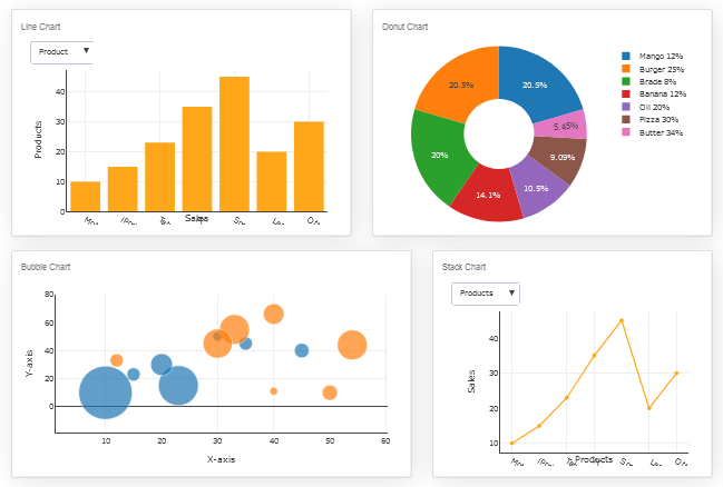
Live and Dynamic Dashboard
Dynamic Dashboards are not only crucial and all-mandatory, but they also hold great beneficial convenience with the uncertainties that have drastically increased after your entrance at the C-suite.
Instead of frantically typing away at your keyboard, installing that raw data into something useable which is so slow and tedious to get out, you can now use Dynamic dashboards to your well-being, and this article will show you how!

What is Dynamic Dashboard?
The term is simply derived from the regular Dashboards present in your cars. It indicates where your business stands and visual figure of speeches, likewise the dashboards in your cars showing you how it’s doing, ie; speed, the temperature of its engine, the fuel level, etc. The only difference is that dynamic dashboards empower you to dig deeper into your data analysis. This means, it not only shows you the revenue getting a sudden and large move in the price of the asset, but it also lets you examine and figure out where the revenue is generating and coming to you from and pinpoint what it holds for your business in the coming future.
Why Dynamic Dashboard is a must-have?
We live in a world where every existing business specifies a swift and stiff come back to the changes made around them compulsory, or they will be lacking back. It may be possible but it is not likely to happen or probable to accurately respond to the needs of their customers on time using manual processes. The only way to keep up with the required decisions of your valued customers is through digital transformation and strategy. Dynamic Dashboards uses business analysis to do exactly that!
It shows you an eminently fair and admonished view on your business and can help you make supportive decisions and reaching conclusions.
More benefits of a Dynamic Dashboard
1. Visibility of the objectives and the progress made:
Upon starting a new enterprise, you’re filled with ardour and avidity, but it’s common for a human mind to not find it as riveting after a few weeks in, this actively demonstrates that frequent typical business days take over again, and the eye captivating purpose of the enterprise fade to the background and is not as enthusiastic anymore. The dynamic dashboard allows you to view the visibility of the objectives and everyone’s progress towards them on monitors situated deliberately around your offices
2. Helps drive ongoing refinements and improvements:
The dashboard makes the chart numbers that matter visible through its staggering activities, which has the same effect as showing a group of people a number on a chart, they will evidently influence with their actions, picking the highest number possible. That’s exactly how dashboards help drive ongoing refinements and improvements
3. Maximum productivity with minimum effect:
Dynamic Dashboard makes the data straightforward and more efficient for each user in the organization achieving maximum productivity with minimum effort
4. Fewer responsibilities for the administrators of the business:
The need of replicating dashboards is completely abolished which means the task is completed in a shorter period of time, therefore, streamlining and reducing the responsibilities of carrying out the administration of the business.
5. Allows to analyze the project in great depth::
One of the biggest benefits Dynamic Dashboards have is that they have got the ability to go to successively deeper levels of the hierarchically arranged database and the underlying data. If you wish to see the cause of an unexpected, minor deviation on your graph, click on the spot and bring up the data underneath. That way, you can analyze and examine the project or the task in further depth, making your work easier..
6. Dynamic dashboards have complete access to the underlying data:
You can always change what you see in the dashboard, if you need to. But only until you have set up the reports, graphs, and tables that you want to see. Dynamic dashboards are configurable. However, keeping a view on the projects over and over again, especially as to be fair and accurate lets you compare progress over time and estimate and measure different projects more easily.
7. The way of presenting the data is customizable:
Dynamic dashboards have a complete approach to access the underlying data and it has a simple and straightforward way of changing the way the data is presented. Everyone has different preferences and likings of the way they want to view their data. For example, you might wish to view your data in a long list of milestones, while your project sponsors might like to see them in a timeline.
Contemporary ways of reporting
To stay lucrative and ahead of the game, it is the main ability to withstand the force and the main predominant to make upstanding and reputable decisions and take the initial step whenever you feel you could use more information
To sum up, everything that has been clearly stated and identified so far, we have recognized how Dynamic Dashboards make your key business system and standards of measurements achieved without much difficulty and a lot of effort and easily understandable for everyone that they hand over the data and the accurate understanding as fast as you need them. You can make open-minded and strategic conclusions and resolutions without much considerations that will make your IT and business move forward and advance in position and progress resulting in your business forging ahead further more!
Are you ready to try your hand at Dynamic dashboard? Try Dynamic Dashboard Builder free forever!
George Lewis, Digital Marketing @DashboardBuilder
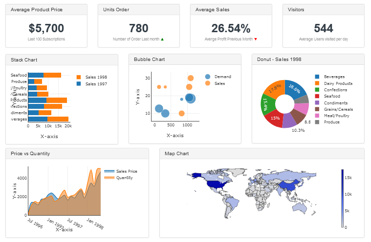
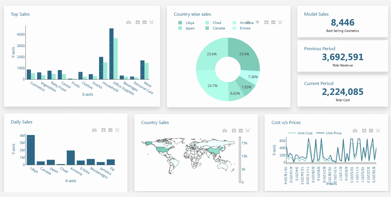
Dashboard examples overview
These great tips and expert techniques given in the examples can be used to create your dashboard in a remarkably and simple way to facilitate you with a great rich filter control to track and monitor your key performance indicators and improve the visualization of your business metrics in a simple way.
5 reasons why your website dashboard
needs to be visually attractive
The five most important aspects of visualizing an attractive website dashboard — How it works? Just take a quick look in a glance

Selling your products and services can be challenging. You have to educate your would-be customers about the various advantages of doing business with you. You also have to instill trust in them to engage more fully with your brand.
A lot of salespeople fail to realize that the website dashboard is an excellent sales tool as well. It not only provides valuable data, but it does so in a visually attractive manner that inspires trust and confidence. Many website designers seek help from IT support companies; however, many IT companies help you adopt the perfect strategies, such as IT support services in San Diego, from where you can Receive high-quality support from a team of qualified experts.
So, there are several ways in which having an aesthetically pleasing website dashboard bolsters conversions. Here are just five of them:
1. It makes for good branding
Your company's website represents you or perhaps your entire company, depending on what type of organization you run. It represents you, first and foremost, because it's your online presence. Secondarily, however, it has the power to represent your brand as well.
When a visitor lands on your website for the first time--before they even explore its content--what does it say about you? Is the background dark and foreboding? Does it have ugly-looking graphics that resemble clip art from the 1990s? Or is the background light inviting to look at? Perhaps banners or other graphical elements don't inspire trust or confidence in your visitors.
If so, you might want to consider having a new website design created for your company. Ensure that it's properly optimized to help people find their way around quickly and easily. But make sure that the design itself is attractive, functional, and conducive to fostering positive brand associations with your enterprise.
2. It utilizes visual cues
On a related note, having a visually appealing website dashboard makes it easier for people to digest the information you're presenting to them on your site. For example, when people look at charts or graphs, their eyes are naturally drawn to what appear to be essential elements of the graph. A visitor might immediately focus on a certain line in a graph rather than another because of its color pattern or shape. Using various types of graphs can help you get across an idea more effectively.
Some businesses might need simple text-based data presentation, while others benefit from including beautifully designed graphics along with their stats. But you can't assume your visitors will know what to look for immediately, so it's best to include visual cues that encourage them to consider the information at hand with an unbiased eye.
3. It provides something beautiful to look at
Putting up a website dashboard doesn't mean people will engage with it right away. They might not even spend much time on it, depending on how they view its users about the rest of the content on your site.
If you want more traffic directed towards your website dashboard--and thus, hopefully, get more conversions from such visits--then you need to make sure there's plenty of incentive for doing so. One way of ensuring this is by creating something aesthetically pleasing that people want to look at.
By creating something beautiful, you can inspire curiosity in your visitors and cause them to explore the information it presents more carefully. Sure, there might be quite a bit of textual information about how this or that works on your website dashboard. But if its design is attractive enough for people to spend time examining it closely--even just quickly skimming through it--you've done an excellent job.
4. It inspires confidence in what you're selling.
In general, I think we can all agree that when somebody's reaching into their wallets to pull out some cash, they need a little reassurance that they're making the right decision with their purchase. In other words, they need a little encouragement from the people selling them the product or service they're investing in.
A beautiful-looking website dashboard can help you build that sense of confidence and comfort with your product or service. People want to be assured they're making a wise decision, and they also want to feel like their needs are being taken care of properly.
The more aesthetically pleasing and functional you make your website dashboard, the better off you'll be overall. When people spend time on it and come away impressed with what's been presented to them, this reassurance is reflected in their actual buying habits. It often results in profitable transactions for those who offer services such as bulk SMS.
5. It makes for good content marketing.
When someone spends some time engaging with your website dashboard, you can utilize that opportunity to present them with other content or offers for buying more of your services. After all, the people who visit your site are finally in a position where they've expressed some level of interest in what you're offering--even if it's because the beauty and functionality of your website dashboard has intrigued them enough to spend time on it.
Wrapping Up!
It means that when anyone makes their way into your website dashboard, they should immediately be offered something else that can benefit them--for free. Even highlighting exactly how much value you're offering by providing this information is often enough to convince someone to engage further with your business. When done well, this type of marketing strategy doesn't even feel like marketing at all--because you're not forcing your visitors to look at ads or anything like that. Instead, they're allowed to explore the offerings on their terms and in a way that's convenient for them.
In the end, creating a beautiful website dashboard is an excellent opportunity for you to stand out from others offering similar services online. It allows you to offer more value by making it aesthetically pleasing and tremendously functional, thus allowing potential buyers to trust what you have to offer while also getting some encouragement from it.
Are you ready to try your hand at website dashboard ? Try Website Dashboard free forever!
Rabia Gul, an enthusiastic guest writer
Business forecasting dashboard overview
Business Forecasting Dashboard is a data forecasting dashboard powered by the Dashboard Builder, a machine learning engine that provides statistics to predict the future. It is available for all platforms including Windows, Linux and Mac. The Forecasting Dashboard is scalable, flexible and required no code.
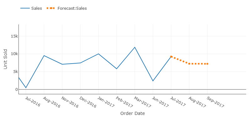
What is business forecasting dashboard?
Business forecasting dashboard aggregates and analyses historical data to anticipate future outcomes in a single glance, this technique is also called Predictive analytics. Predictive analytics leverages statistical techniques like data modeling and machine learning.
While these outcomes cannot predict exactly what will happen in the future, a business forecasting dashboard helps you to identify trends, herald disruptive industry changes, and allow data-driven decision making.
Forecasting dashboard in the real world
Forecasting dashboard uses data analysis to predict future outcomes, allowing you to gain valuable insights and make more informed business decisions. With a forecasting dashboard, you can use your data to recognize trends, predict future events, and identify business risks and opportunities. No matter your industry, a forecasting dashboard helps you anticipate your business needs and understand consumer trends.
How forecasting dashboard works
Forecasting dashboard analyses data to predict future events from stems of statistical science. Predictive modeling involves giving the presence of particular variables in a large dataset a certain weight or score. This score is then used to calculate the probability of a certain event occurring in the future. For this reason, the forecasting dashboard uses regression modeling approaches in predictive analytics.
Regression models
Regression models are less black and white. Instead of a 0 or 1, regression models will predict an actual number. Consider an example in healthcare: let’s say a member has a BMI of 29. A regression model might predict that the member’s BMI could drop 3 points in the next year with a consistent, healthy diet.
There are several techniques data scientists use to construct classification and regression models. The least-squares regression technique uses to find the estimated outcome.
Forecasting dashboard in the dashboard builder is a Statistical Function that computes the linear trend line based on the given linear set of data. It calculates the predictive values of Y for given array values of X and uses the least square method based on the given two data series. The forecasting dashboard returns numbers in a linear trend matching known data points that is the existing data on which the trend in dashboards predicts the values of Y dependent on values of X needs to be linear data.
What is the least square Technique?
The Least Squares Regression Line is the line that makes the vertical distance from the data points to the regression line as small as possible. It’s called a “least squares” because the best line of fit is one that minimizes the variance (the sum of squares of the errors). This can be a bit hard to visualize but the main point is you are aiming to find the equation that fits the points as closely as possible.
It is a technique used in the regression analysis that finds the line of best fit (is a line through a scatter graph of data points that foremost indicates the relationship between those points) for a given dataset, which helps to visualize the relationship between the data points. .
How to Use forecasting in the dashboard builder?
With these great tips and expert techniques in the examples were used to create your forecasting dashboard in a remarkable and simple way to facilitate you to create the highest level of extremely attractive predictive analytic dashboards for professional businesses with no code and without programming skills required, in a matter of minutes.
Forecasting in the dashboard builder is very simple and easy to use. Let us understand the working of the forecast function by the following example.
Predicting the Sales Growth
In the following example, we have existing sales data of a company for the fiscal year 2016-2017 that increases linearly from July 2016 to June 2017. We need to figure out the sales for the given upcoming months. That is, we need to predict the sales values based on the predictive values for last year's data.
The existing data contains the order date and the unit sold. We need to calculate the estimated sales value for the next 5 iterations. Historical Data is given below:

In order to predict the sales for the given upcoming months in the next fiscal year, we will use the forecasting function in the analytics tab since the sales value is increasing linearly, the given known values of Y is the item sold, and the known values of X are the order dates of the month, the new values of X are the dates for next months. The difference between months is automatic calculated using the standard division functions., and we need to compute the estimated sales values based on historical data given.
Requirements
There are very easily attainable requirements to run your Business Forecasting Dashboard. The Forecasting Dashboard was built by the pioneer dashboard builder firm, a kind of flimsy utility, which was built in an intelligible way and does need minimal requirements to run.
Pre-requisites
Before starting this tutorial, you should:
- PHP Version 7 or later
- Apache 2 or later
- JSON is enabled
Take a look at this how to guide If you are using a desktop version of the Dashboard Builder in MS Windows.
Real-time Dashboard runs on all SVG-compatible browsers such as:
- Windows 7 or later /Linux 3 or later
- Firefox 52, Chrome 57, IE
- Real-time Dashboard Builder is available for downloading
Installation
There is a Free version of the real-time dashboard builder also available
- You can download the dashboard dashboard code fromDownload Dashboard Builder
- Place the files in a directory on the web server. e.g.
…/www/yoursite/dashbboardbuilder-v4-FREE/ - Unzip
 the file dashboard.zip using Extract Here option to the root folder of "dashboardbuilder"
Fetch data from MySQL
With the help of the following easy steps, you can fetch complex data from the MySQL database and create the highest level of extremely attractive predictive analytic dashboards for professional businesses with no code and without programming skills required, in a matter of minutes.
- Retrieve data from MySQL dashboard
- Assign data to X and Y-axis column.
Retrieve data from MySQL dashboard
This section of the article helps you to understand how to connect to the MySQL database. To proceed further, you need to make sure that you have already installed the dashboard builder tool and you meet all the prerequisites .
- STEP-1 Launch the dashboard builder, if you are using on-prem version then run the dashboard builder in a browser
- STEP-2 Click the database icon
- STEP-3 On the database tab, enter the database credentials of your database and hit the Save Changes button.
- STEP-4 Click the gear icon to open the chart properties windows
- STEP-5 On the next screen; select Line graph from the drop-down list of chart type. Select order date in X-axis and unit sold in Y-axis
- STEP-6 Now, click the Analytics tab.
- STEP-7 Save your changes and your business forecasting dashboard is ready. You have various options to publish your forecasting dashboard.
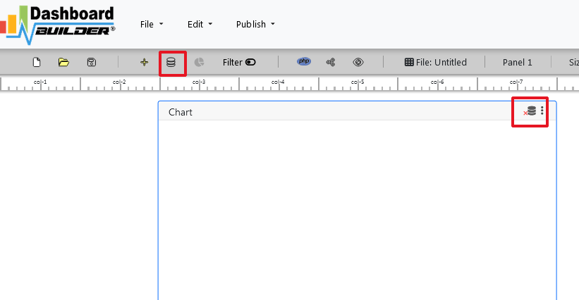
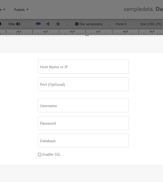


Aggregate sum monthly sales by check the month on X-axis in ascending order and Sum on Y-axis.


the forecast number is enabled, you must have a date in your X-axis in order to forecast your sale otherwise this button would not be enabled.
We can see here again in the solid line this is our actual data. And then based on the actual data and pattern over time with that data, the dashboard builder can through various statistical algorithms produces a forecast of what we should expect.

Enter the number of iterations we want to the dashboard builder to forecast.
Video tutorial on how to create a Forecasting dashboard with Dashboard Builder®
Share your business forecasting dashboard with your team
You can publish and share your dashboard with your team using just one click. This great dashboard tool for the real-time Dashboard generates the URL for your dashboard to share with your colleagues. Not only this, the dashboard builder has a powerful PHP code generator plugin installed, which generates PHP code for your dashboard in just one click. This auto-generated PHP code for your dashboard is published under the MIT license, which you can customize as per your desired needs and can be used or embedded inside of your PHP application.
No Code Dashboard - A Step-by-Step Guide to Create Dashboards with No Code
Discover all the resources you need to start building your own personalized dashboards with No Code

What is a No code Dashboard platform
Instead of traditional computer programming, no-code dashboard platforms allow programmers and non-programmers to create dashboard software utilizing drag-and-drop graphical user interfaces and setup.
In this post, we'll show you how to use the dashboard builder's no-code feature to create your own dashboard without writing any code. Traditionally, creating a completely unique dashboard would necessitate the services of one or more experienced software engineers. However, as the no-code landscape evolves, it's becoming easier than ever for makers all around the world to create their own complex dashboard, chart and graph.
Dashboards can take different forms, depending on the data they display and the final use case. The Dashboard Builder is the ideal visualization tool for supporting the changing requirements of a bespoke dashboard, with features such as design flexibility, data visualization, and integration.
This guide offers important advice and resources for you to consider when you begin constructing your app, whether you're trying to create a highly visible tool for your internal team or are just starting started with the Dashboard Builder.
How to Create a Variety of Dashboard Apps
No code Dashboard platforms Showcase:
The Dashboard builder no code has been used by many users to create dashboards.Here are a few instances of what that means:
Getting Started on Your Dashboard with No-Code
Your dashboard app will only be as good as the preparation work you put in ahead of time. Let's start with the most important considerations:
- Create a User Interface for your dashboard.
- Set up the Data Sources and Structure for your dashboard.
- Create data visualizations.
Requirements
Data visualization tool can be installed any platforms like Windows, Linux and Ubuntu or any other platforms support Apache, Nginx etc.
- PHP Version 7.2 or later
- Apache 2 or later
- Windows 7 or later /Linux 3 or later
- Firefox 52, Chrome 57, IE 8
Installation
There is a Free version of Dashboard Builder available for trail bases,
- Download from https://dashboardbuilder.net/download-free-dashboard
- Place the files in a directory on the web server. e.g.
…/www/yoursite/dashbboardbuilder-v3-FREE/ - Unzip
 the file using Extract Here option to the root folder of "dashboardbuilder"
Create a User Interface for your dashboard
- Run the web folder in your browser. e.g. http://localhost/dashboardbuilder following welcome screen will appear.
- This is the main panel of the Data visualization tool. This is a HTML5 based fully responsive interface built in PHP, HTML, JavaScript and CSS. The interface has a minimal design with a drag-and-drop feature that allows you to add multiple chart panel to customize the dashboard on according to the way you want.

Set up the Data Sources and Structure for your dashboard
- Now Click the Database icon
- Following screen will appear. In our Data visualization example, we will use the sample SQLite database called Northwind.db to connect and fetch the data. Now, Select Database from data source tab. Select SQLite from the drop down list of Database, Enter your
"../data/Northwind.db"in the DB name field and Save changes as mentioned in the screen.

- When you click the save changes, a green tick mark with Database will appear that shows that your database is successfully connected.
Create visualizations with no code dashboard platform
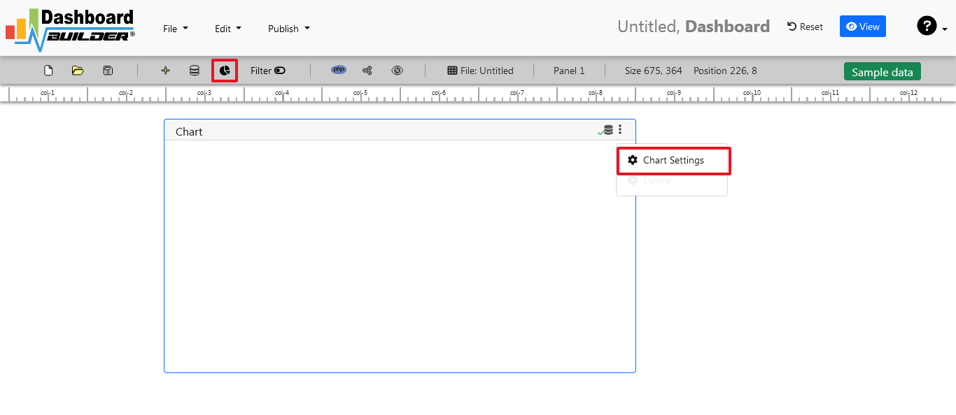
- In our next step, we will fetch data from the database we have just connected. Select the gear icon for your Chart preference.

- The following screen will appear. List of the tables from Northwind.db will appear on the table list as shown in the picture below.

SQL statements
- In our example, we will be creating a simple PHP application for our sales management. This PHP dashboard will contain a chart where users can find the sales stats and maintain the data about the products.
- Now, enter the following SQL statement in text box in a following manner
SELECT strftime('%Y-%m',o.shippeddate) as xaxis, sum(d.quantity) as yaxis from `order details` d, orders o where o.orderid = d.orderid group by strftime('%Y-%m',o.orderdate) limit 50
- Now, we want to execute our query and fetch the data from the tables. Click the Run Query button

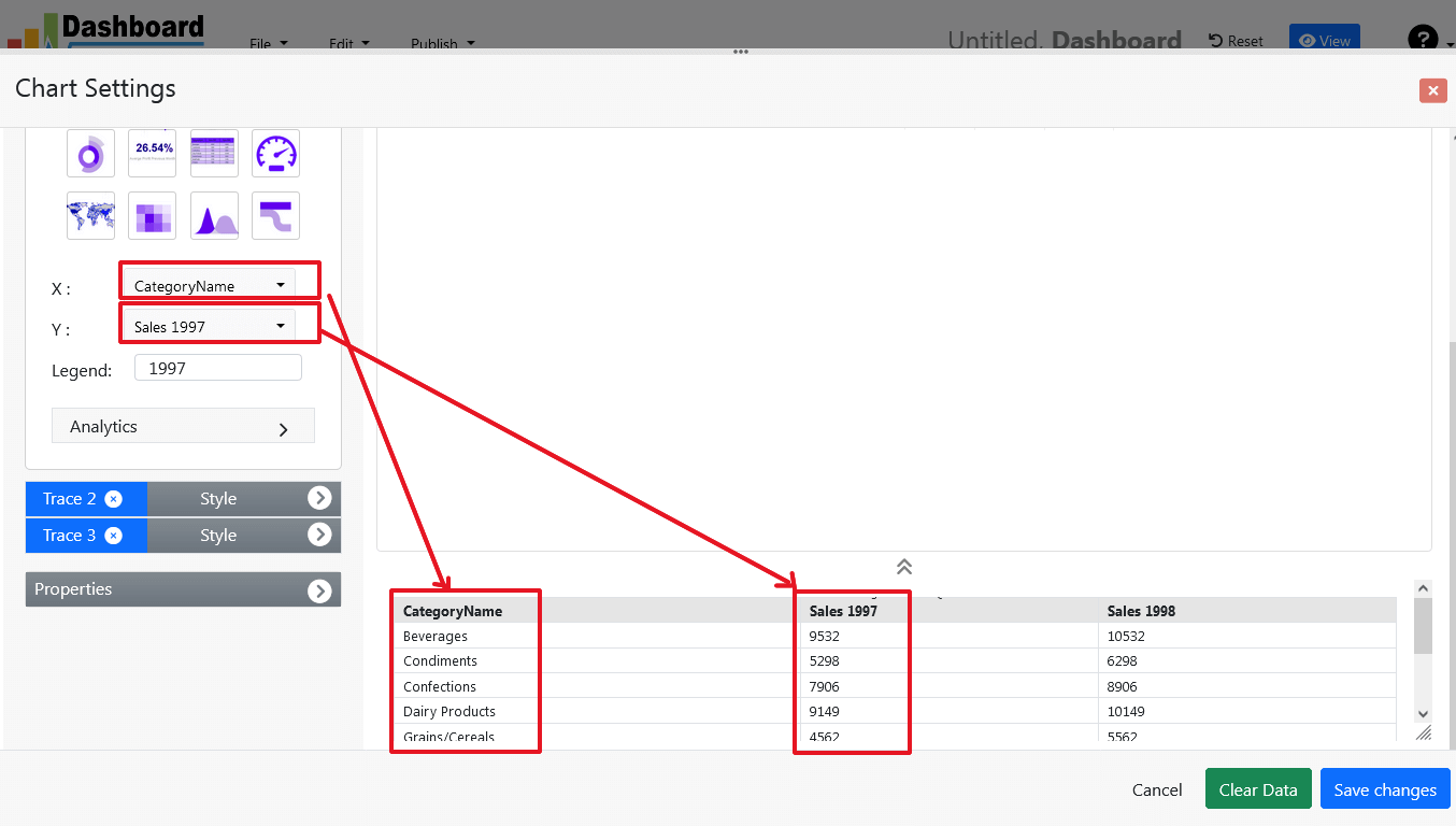
- Query Result will appear. Now, we have to assign x-axis data to the x-axis column and y-axis data to the y-axis column. Select your x-axis data from the drop down list of X and y-axis data from the drop down list of Y .
- Click Save Changes
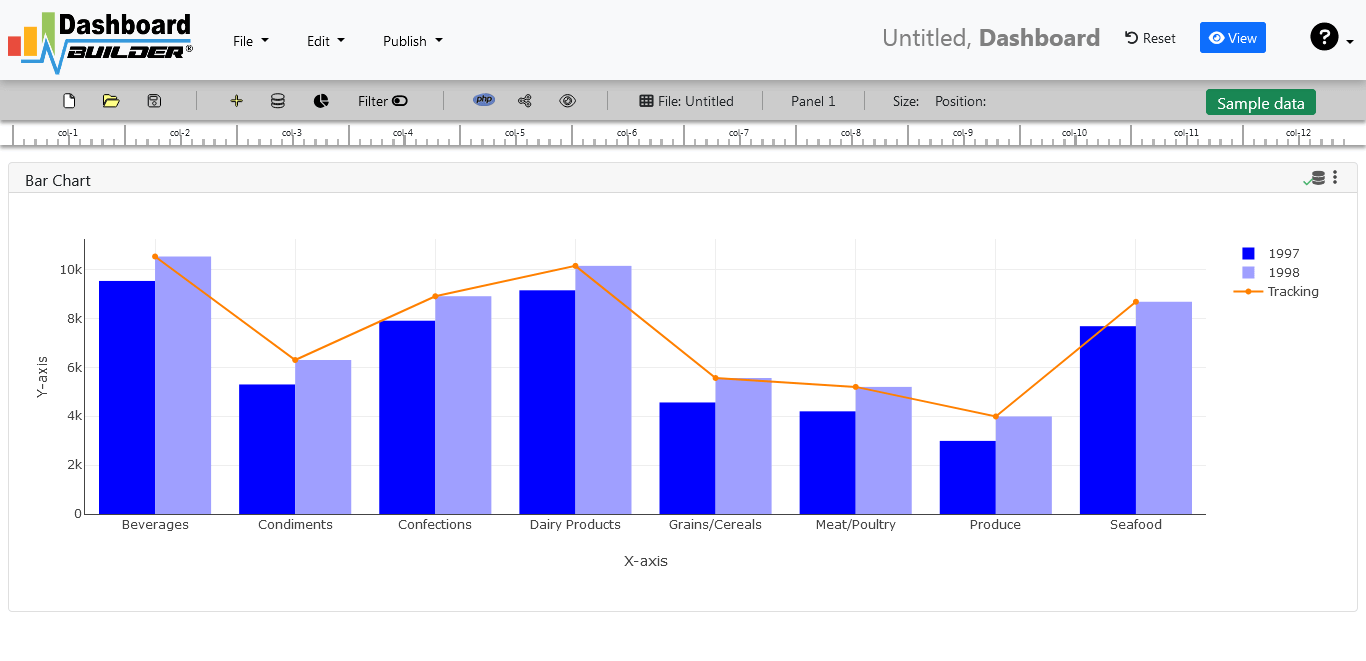
- Charts will be appeared on the screen as shown below.
Adjust the position
- You may adjust the size and the position of the Chart Panel by dragging its corner. The size and position are fully responsive according to the Bootstrap framework
PHP code generation
- So far we have successfully build our dashboard. In this step we are going to generate PHP source code for dashboard we have just created. Click the Generate button to auto-generate PHP source code for our dashboard

- PHP code for the chart will automatically generate, you may copy past this code to your PHP application.
No code Dashboard platform tool source code
Following is an example of Data visualization tool. You may copy & paste the following PHP code in your web application.
/**
 * DashboardBuilder
 *
 * @author Diginix Technologies www.diginixtech.com
 * Support  - http://www.dashboardbuilder.net
 * @copyright (C) 2018 Dashboardbuilder.net
 * @version 2.1.5
 * @license: license.txt
 */

include("inc/dashboard_dist.php");  // copy this file to inc folder


// for chart #1
$data = new dashboardbuilder();
$data->type =  "line";

$data->source =  "Database";
$data->rdbms =  "sqlite";
$data->servername =  "";
$data->username =  "";
$data->password =  "";
$data->dbname =  "data\Northwind.db";
$data->xaxisSQL[0]=  "SELECT strftime(^%Y-%m^,o.shippeddate) as xaxis, sum(d.quantity) as yaxis from `order details` d, orders o  where o.orderid = d.orderid group by strftime(^%Y-%m^,o.orderdate) limit 50";
$data->xaxisCol[0]=  "xaxis";
$data->yaxisSQL[0]=  "SELECT strftime(^%Y-%m^,o.shippeddate) as xaxis, sum(d.quantity) as yaxis from `order details` d, orders o  where o.orderid = d.orderid group by strftime(^%Y-%m^,o.orderdate) limit 50";
$data->yaxisCol[0]=  "yaxis";
$data->name = "linechart";
$data->title = "Line Chart";
$data->orientation = "";
$data->xaxistitle = "x-axis title";
$data->yaxistitle = "y-axis title";
$data->showgrid = "";
$data->showline = "";
$data->height = "167";
$data->width = "";
$data->col = "0";
$result[0] = $data->result();

?>

<!DOCTYPE html>
<html>
<head>
	<script src="assets/js/dashboard.min.js"></script> <!-- copy this file to assets/js folder -->
	<link rel="stylesheet" href="//maxcdn.bootstrapcdn.com/bootstrap/3.2.0/css/bootstrap.min.css"> <!-- Bootstrap CSS file, change the path accordingly -->

<style>
@media screen and (min-width: 960px) {
.id0 {position:absolute;margin-top:67px;}

}
.panel-heading {line-height:0.7em;}
#kpi {font-size:34px; font-weight:bold;text-align:center;}
#kpi_legand {font-size:11px; color:#999;text-align:center;}
</style>


</head>
<body>

<div class="container-fluid main-container">
<div class="col-md-12 col-lg-12 col-xs-12">
<div class="row">
<div class="col-md-4 col-lg-4 offset-md-4 offset-lg-4 col-xs-12 id0">
<div class="panel panel-default">
<div class="panel-heading">Line Chart</div>
    <div class="panel-body">
        <?php echo $result[0];?>
    </div>
</div>
</div>
</div>
</div>
</div>
</body>
The auto-generated PHP code is under MIT license, which you may customize as per your desire needs and can be used an anywhere you want. You can find the complete information about the license here
Conclusion
Now we have a PHP based dashboard that can be used with any web application that was customized to fit the requirements of the web design. The project also offers free and paid plans. You can also download No Code Dashboard Builder FREE version. The code for Dashboard Builder can be found on GitHub under this license
Best of all, with our Pro and Premium licenses include 100% source code, for you to enhance the functionality or incorporate PHP code into your web application or any PHP software solutions/products, analytics/data science/data warehouse enterprise systems or Joomla, Wordpress or Drupal sites.
All editions of our Data visualization tool series are still fully functional, for sale and supported and provides increasing levels of support to address the queries of users and developers.
No code dashboard visualization tool can also be implemented using an online API where you don’t have to mix with PHP code. The online API uses universal HTML code which can be used in any platform. The data will be added or retrieved from the database using the API. You may find more information about the Online Dashboard.
You may want to take a look at our complete documentation and video tours of the latest version along with a live tour of user interface and step by step instructions for performing key features.
OR
Get started with a free account



 the file dashboard.zip using Extract Here option to the root folder of "dashboardbuilder"
