Data Visualization Tool
Visualize your Data with this great Data Visualization Tool
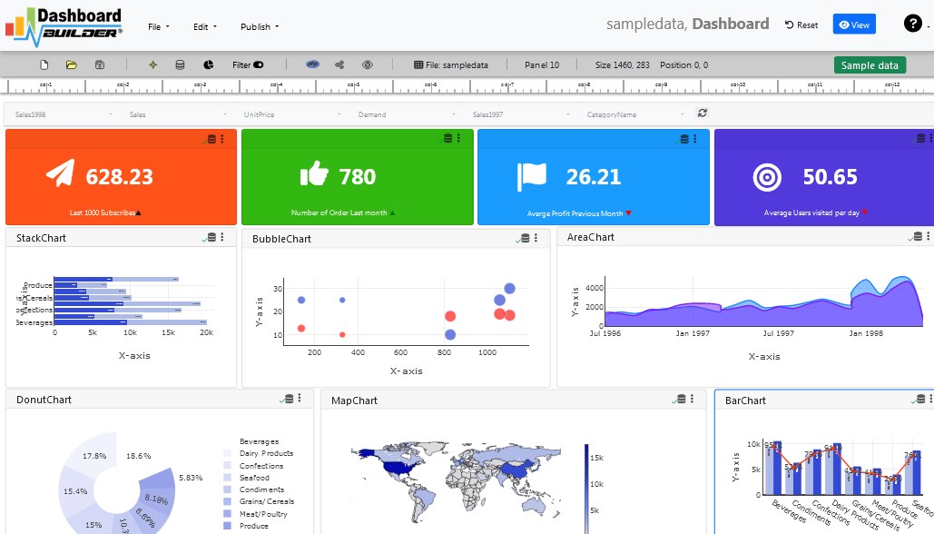
An overview of the best free data visualization tools
Data visualization is an Open Source HTML5 based tool helps you to create your charts and dashboard. This is a PHP based tool built in Apache + PHP + MySQL + Free Charting Engine, which is designed with drag-and-drop and ease-of-use at top of the mind which is customizable in a number of ways.
Figuring out how to best visualize your data can be challenging. May be you started out by creating a few graphs in a spreadsheet and are trying to find a way to tie them all together. Or maybe you're working with an existing analytics tool and want to find a way to make your data more accessible to a wider audience. Or perhaps you've gone several real-time sources and are trying to find a way to tie them all together. Fortunately, there is an open source data visualization tool available for you
Data visualization tool supports a variety of different charts that includes but not limited to line chart, scatter chart, bar chart, pie chart, donuts chart, bubble chart, stack chart, area chart, heatmap chart, sankey diagrams and choropleth map etc.All these are D3.js based dynamic chart. You may like to see D3.js based dynamic Data visualization tool example. Our data visualization tool can be used to create either static or real-time database driven dashboards with data coming from a variety of sources such as MySQL, MS SQL, SQLite, ORACLE, PostgreSQL, Sybase and Cubrid with no programming required. A part of the community, this tool is designed to integrate with a PHP application you may be using and also import data from MS Excel and CSV files.
As we know, PHP is a well-known very popular open source server-side scripting language for creating dynamic websites and interaction with database such as MySQL. In the following tutorial, we are going to create dashboard without writing a single code with drag and drop features of this great data visualization tool.
Understanding Data Visualization Techniques
A graphical representation of information and data is known as data visualization. Data visualization tools, which use visual elements such as charts, graphs, and maps, make it easy to see and understand trends, outliers, and patterns in data. This blog on data visualization techniques will help you understand the details and benefits of the techniques.
Data visualization tools and technologies are critical in the Big Data world for analyzing massive amounts of data and making data-driven decisions.
Advantages of Effective Data Visualization
Colors and patterns catch our attention. We can easily distinguish red from blue and square from circle. Everything in our culture is visual, from art and advertisements to TV and movies.
Data visualization is another form of visual art that captures our attention and keeps it there. When we look at a chart, we can quickly identify trends and outliers. When we see something, we quickly internalize it. It's narrative with a purpose. If you've ever looked at a massive spreadsheet of data and couldn't find a trend, you understand how much more effective a visualization can be. The following are some of the Applications of data visualization.
- A powerful way to explore data that produces presentable results.
- The primary application is in the pre-processing stage of the data mining process.
- Helps with data cleaning by detecting incorrect and missing values.
- Variable derivation and selection refer to deciding which variables to include and exclude from the analysis.
- As part of the data reduction process, they also help to combine categories.
Data Visualization Techniques
- Sunburst
- Histograms
- Heat maps
- Charts
- Choropleth map
- Sankey diagrams
Methods for Visualizing Data
Column chart: A vertical bar chart in which each category is represented by a rectangle. The height of the rectangle is proportional to the plotted values. Bar Chart: It has rectangular bars with lengths that are proportional to the values represented. Stacked Bar Graph: It is a bar graph with various components stacked together so that, in addition to the bar, the components can be compared to one another. Stacked Column Chart: It is similar to a stacked bar chart, but the data is stacked horizontally instead of vertically.
- Area Chart: It combines the line chart and the bar chart to show how the numerical values of one or more groups change as a viable area progresses.
- Line Graph: The data points are connected by a straight line, resulting in a representation of the changing trend.
- Pie Chart: It is a chart in which various components of a data set are presented as a pie chart, representing their proportion in the overall data set.
- Bubble Chart: It's a multi-variable graph that's a cross between a scatter plot and a proportional area chart.
- Scatter Plot Chart: It is also known as a scatter graph or scatter chart. Dots are used to represent the values of two numerical variables.
- Heat Map: It is a data visualization technique that displays the level of instances as color.
Getting Started
In this data visualization example, we'll create a simple dashboard and then generate the PHP source code for our web application. To do this, we demonstrate the use of our open-source drag-and-drop visualization tool, available for free. The following requirements apply to installing and running the data visualization tool.
Requirements
Data visualization tool can be installed any platforms like Windows, Linux, Mac and Ubuntu or any other platforms support Apache.
- PHP Version 7.2 or later
- Apache 2 or later
- Windows 7 or later /Linux 3 or later
- Firefox 52, Chrome 57, IE 8
Installation
There is a Free version of Dashboard Builder available for trail bases,
- Download from https://dashboardbuilder.net/download-free-dashboard
- Place the files in a directory on the web server. e.g.
…/www/yoursite/dashbboardbuilder-v3-FREE/ - Unzip
 the file using Extract Here option to the root folder of "dashboardbuilder"
Data visualization examples
Before connecting the database and getting the data with the data visualization tool, make sure your web server (such as Apache, Nginx, etc.) is configured to view the documents in the folder containing the dashboard. Read and write permission for dashboardbuilder directories and subdirectories, for example chmod -R 777 dashboardbuilder-v57-FREE. Check your browser inspector/console to make sure that no errors are reported and that all Open Source Dashboard builder files are loading correctly.
STEP-1: Connect with your Database
- Access the web folder in your browser. e.g. http://localhost/dashboardbuilder following welcome screen will appear.
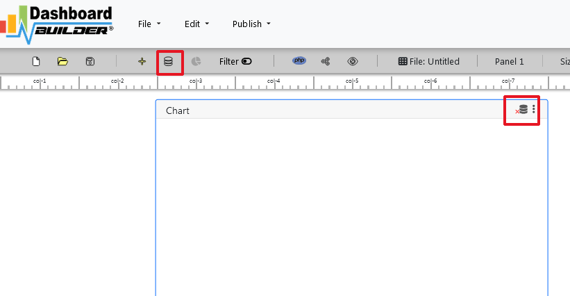
- This is the main panel of the Data visualization tool, a fully responsive HTML5 based interface built with PHP, HTML, JavaScript and CSS. The interface has a minimalist design with drag and drop functionality, so you can add different chart and customize the dashboard the way you want.
- Now Click the Database icon
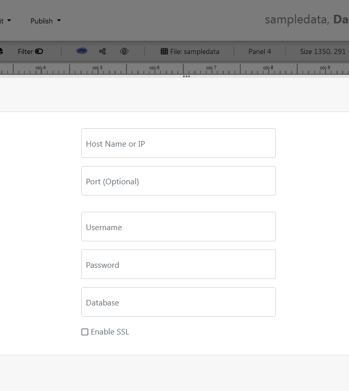
- The next screen is displayed. Select a database on the Data Sources tab. Select SQLite from the database drop-down menu, enter
../data/Northwind.dbin the Database name field and follow the on-screen instructions to save the changes.
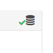
- When you click the Save changes , A green tick mark with a database appears, indicating that your database has been successfully connected.
STEP-2: Chart settings
- In the next step we will retrieve the data from the database we just connected. Select the gear icon to the chart preferences.
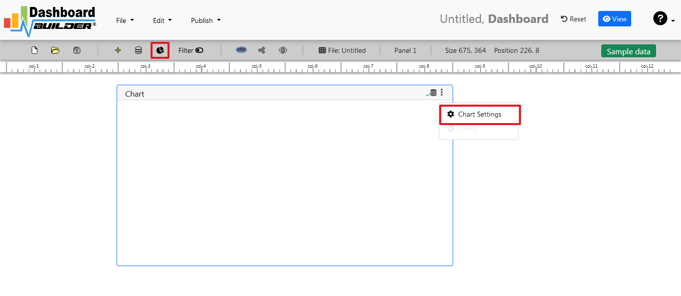
- In the next screen a list of tables is displayed.

STEP-3: SQL statements
- In our example we will create a simple PHP application for our sales management. This PHP dashboard will contain a chart where users can find sales statistics and track product data.
- Now enter the following SQL statement into the text box as shown below
SELECT strftime('%Y-%m',o.shippeddate) as xaxis, sum(d.quantity) as yaxis from `order details` d, orders o where o.orderid = d.orderid group by strftime('%Y-%m',o.orderdate) limit 50
- Now, we want to execute our query and fetch the data from the tables. Click the Run Query button
- The query result will be displayed. Now we must assign data from the x-axis to the x-axis column and data from the y-axis to the y-axis column. Choose your x-axis data from the X drop down list, and your y-axis data from the Y drop down list.
- Click Save Changes
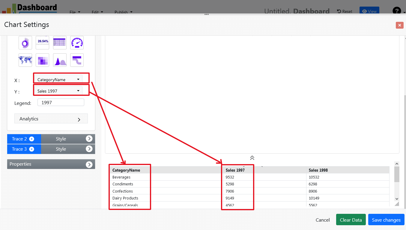
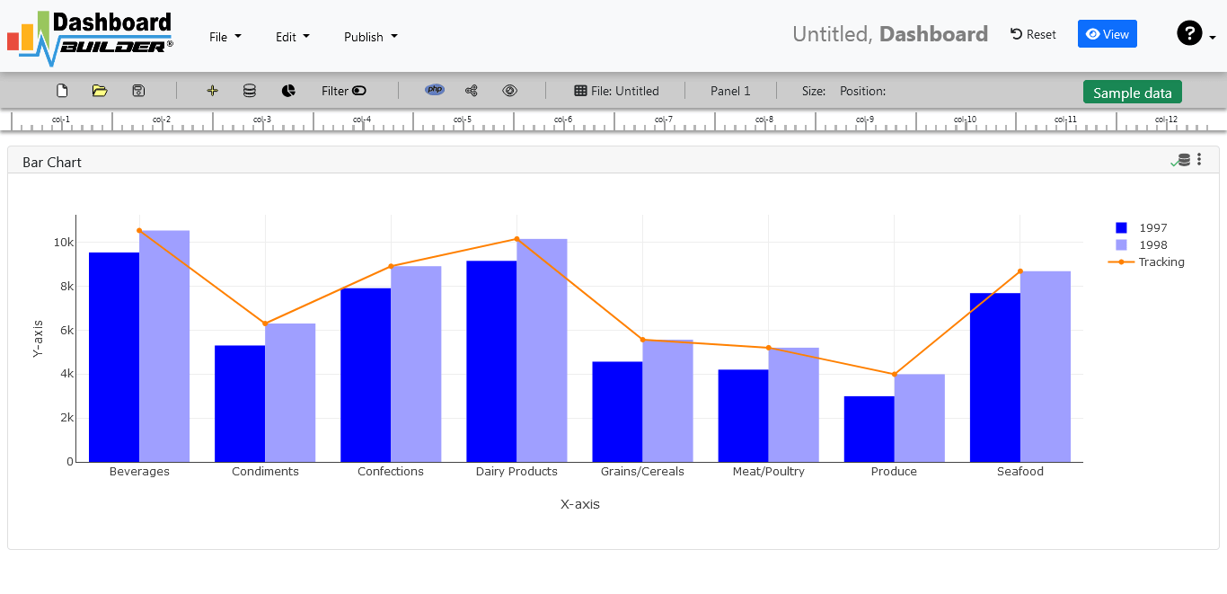
- Charts will be appeared on the screen as shown below.
STEP-4: Adjust the position
- You may adjust the size and the position of the Chart Panel by dragging it's corner. The size and position are fully responsive according to the Bootstrap framework
STEP-5: PHP code generation
- So far, our dashboard has been built successfully. In this step, we will generate the dashboard source code that we just created. To create PHP dashboard source code for our PHP application, click the Generate PHP button.

- The PHP dashboard source code for the chart will be generated automatically; you can copy and paste this dashboard PHP script into your PHP application.
Data visualization tool source code
Following is an auto-generated PHP source code of Data visualization tool. This source code can be used with any PHP application, website, or any other PHP based framework.
/**
 * DashboardBuilder
 *
 * @author Diginix Technologies www.diginixtech.com
 * Support  - http://www.dashboardbuilder.net
 * @copyright (C) 2018 Dashboardbuilder.net
 * @version 2.1.5
 * @license: license.txt
 */

include("inc/dashboard_dist.php");  // copy this file to inc folder


// for chart #1
$data = new dashboardbuilder();
$data->type =  "line";

$data->source =  "Database";
$data->rdbms =  "sqlite";
$data->servername =  "";
$data->username =  "";
$data->password =  "";
$data->dbname =  "data\Northwind.db";
$data->xaxisSQL[0]=  "SELECT strftime(^%Y-%m^,o.shippeddate) as xaxis, sum(d.quantity) as yaxis from `order details` d, orders o  where o.orderid = d.orderid group by strftime(^%Y-%m^,o.orderdate) limit 50";
$data->xaxisCol[0]=  "xaxis";
$data->yaxisSQL[0]=  "SELECT strftime(^%Y-%m^,o.shippeddate) as xaxis, sum(d.quantity) as yaxis from `order details` d, orders o  where o.orderid = d.orderid group by strftime(^%Y-%m^,o.orderdate) limit 50";
$data->yaxisCol[0]=  "yaxis";
$data->name = "linechart";
$data->title = "Line Chart";
$data->orientation = "";
$data->xaxistitle = "x-axis title";
$data->yaxistitle = "y-axis title";
$data->showgrid = "";
$data->showline = "";
$data->height = "167";
$data->width = "";
$data->col = "0";
$result[0] = $data->result();

?>

<!DOCTYPE html>
<html>
<head>
	<script src="assets/js/dashboard.min.js"></script> <!-- copy this file to assets/js folder -->
	<link rel="stylesheet" href="//maxcdn.bootstrapcdn.com/bootstrap/3.2.0/css/bootstrap.min.css"> <!-- Bootstrap CSS file, change the path accordingly -->

<style>
@media screen and (min-width: 960px) {
.id0 {position:absolute;margin-top:67px;}

}
.panel-heading {line-height:0.7em;}
#kpi {font-size:34px; font-weight:bold;text-align:center;}
#kpi_legand {font-size:11px; color:#999;text-align:center;}
</style>


</head>
<body>

<div class="container-fluid main-container">
<div class="col-md-12 col-lg-12 col-xs-12">
<div class="row">
<div class="col-md-4 col-lg-4 col-md-offset-4 col-lg-offset-4 col-xs-12 id0">
<div class="panel panel-default">
<div class="panel-heading">Line Chart</div>
    <div class="card-body">
        <?php echo $result[0];?>
    </div>
</div>
</div>
</div>
</div>
</div>
</body>
This auto-generated PHP source code is generated through the Open Source Dashboard GitHub. It is under MIT license, the most popular software license on GitHub, ahead of any GPL variant and other free and open-source software (FOSS) licenses. It can be downloaded from GitHub.
Conclusion
We now have the source code of our dashboard generated through the Data Visualization tool, which can be used with any web application and adapted to web design requirements. The project also offers free and paid plans. You can also download the Free Open Source version of Dashboard Software. The code for the free open source dashboard can be found on the Open Source Dashboard GitHub with this license
Best of all, with our Data Visualization tool, PRO and PREMIUM licenses include 100% source code so you can enhance functionality or embed the Open Source dashboard into your web application or PHP software solutions / products, analytics / data science / data warehouse business systems Joomla, Wordpress and Drupal sites.
All editions of our Data Visualization tools are still fully functional, available for purchase and support, with growing support to answer questions from users and developers.
The Data Visualization software can also be implemented using an online API where there is no need to combine a PHP script or PHP source code. The online open source dashboard tool uses universal HTML code that can be used on any platform. Data is added to or retrieved from the database using the API. You can find more information on the Online Dashboard
You may want to check out our full complete documentation and video tours of the latest release, along with a live tour and detailed instructions on how to perform key functions.
You may want to take a look at our complete documentation and video tours of the latest version along with a live tour of user interface and step by step instructions for performing key features.
 the file using Extract Here option to the root folder of "dashboardbuilder"