ODBC Dashboard Overview:
ODBC dashboard is a dashboard application tool which helps you to fetch data from a tremendous range of data source through ODBC to get your dashboard up, running and sharing in no time, zero code and without any Expert Techniques or programming skills required.

What is ODBC Dashboard Builder?
Open Database Connectivity (ODBC) dashboard is a kind of unique of data visualization tool which runs without installation in a browser, fetches data through ODBC generates dashboards in few clicks.
Why ODBC Dashboard?
Open Database Connectivity (ODBC) dashboard gives you the freedom to fetch data using the standard SQL query from any data source, from any operating system, and display graphs through a huge range of charts with the help of our powerful visualization tool called Dashboard Builder. Not only this, the ODBC dashboard had a powerful code generator, which generates source code for your dashboard without asking you to write a single line of code in just a few clicks.
Let’s create your first ODBC dashboard.
In the following example, we will create an ODBC dashboard, but before we get started, we need to make sure that the following requirements are met.
Hardware and Software Requirements
There are no such huge requirements to run ODBC Dashboard. The ODBC Dashboard was built by the pioneer dashboard builder firm. The ODBC dashboard is a kind of flimsy utility, which was built in an intelligible way and does not need heavy requirements to run.
Pre-requisites
Before starting this tutorial, you should:
- PHP Version 7 or later
- Apache 2 or later
- ODBC data source
- php_odbc extension for PHP
To enable php_odbc:Take a look in your php.ini, remove ; from extension=php_odbc.dll and restart your Apache server
ODBC Dashboard runs on all SVG-compatible browsers such as:
- Windows 7 or later /Linux 3 or later
- Firefox 52, Chrome 57, IE
- ODBC Dashboard is available for downloading
Installation
There is a Free version of dashboard available for trail bases,
- You can download the dashboard dashboard code fromDownload Dashboard Builder
- Place the files in a directory on the web server. e.g.
…/www/yoursite/dashbboardbuilder-v3-FREE/ - Unzip
 the file dashboard.zip using Extract Here option to the root folder of "dashboardbuilder"
TAKE ADVANTAGE OF THE FREEDOME OF CONNECTIVITY WITH ODBC
With the ODBC dashboard, you can gather all your data sources in one central place. The ODBC dashboard was developed in PHP language, JavaScript, and HTML, it is lightweight, runs in a browser, and doesn’t require any installation. There is a very limited requirement for ODBC dashboard, it requires a web server, which supports and runs PHP scripts, such as Apache, the largest Open Source community for the server-side script, available in almost all famous operating systems including Windows, Linux, and Ubuntu, etc., and an ODBC driver for your desire data source.
ODBC dashboard uses the Bootstrap CSS framework, D3.js library, and HTML5 to render a graph, which displays a responsive and dynamic quality graph from any source of database supported by the ODBC.
An attractive dashboard can be created easily and precisely with the ODBC dashboard. It has a powerful code builder built-in, which does not require any technical skill to build interactive dashboards for your business.
Connect an ODBC data source with a few clicks
With the help of the following easy steps, you can retrieve complex data queries from any data source supported by the ODBC and create the highest level of attractive dashboards for professional business with zero codings and without programming skills in a matter of minutes.
- Connect to your database through ODBC
- Retrieve data using our powerful SQL generator.
- Assign data to X and Y-axis column.
1. Connect to your database through ODBC
This section of this article helps you to understand how to connect to an ODBC data source in Microsoft Windows operating system. To proceed further, you need to make sure that you have already installed your desire ODBC driver to connect to your data source. If not then you may have to download the ODBC driver for your data source. .
2. Make sure the driver you want is installed
- STEP-1 In your Microsoft Windows, search for the ODBC Data Sources in the Start Menu or Control Panel. If you don’t have your desire driver installed, you need to download it
- STEP-2 Launch the ODBC Data Source Administrator, if you are a standard user of Windows then you need to launch the ODBC Data Source Administrator as Windows Administrator.
- STEP-3 On the Drivers tab, you can find a list of all the ODBC drivers installed on your computer.
Here's an example of the list of installed drivers.

Note: If you know that your driver's installed and you don't see it in the 64-bit applet, look in the 32-bit applet instead.
3. Select the data source
The ODBC drivers installed on your computer aren't listed in the drop-down list of data sources. To connect with an ODBC driver, start by selecting the .NET Framework Data Provider for ODBC as the data source on the Choose a Data Source or Choose a Destination page of the wizard. This provider acts as a wrapper around the ODBC driver.
Here's the generic screen that you see immediately after selecting the .NET Framework Data Provider for ODBC.

4. Provide the connection details
The next step is to provide the connection info for your ODBC driver and your data source. You have two options.
In this article, we will go through with option 1 that is through a DSN
Option 1 - Connect datasource through DSN
If you want to provide the connection information with a DSN (data source name), use the ODBC Data Source Administrator applet to find the name of the existing DSN, or to create a new DSN.
- Search for or browse to the ODBC Data Sources applet in the Start Menu or Control Panel.
- Launch the applet. The ODBC Data Source Administrator window opens. Here's what the applet looks like.
- To create a new DSN, you need to decide whether you want it to be visible only to you (User DSN), visible to all users of the computer including Windows services (System DSN), or saved in a file (File DSN). This example creates a new System DSN.
- On the System DSN tab, click Add.
- Line
- Bar
- Stack
- Scatter
- Area
- Pie
- Donuts
- Bubble
- Gauge
- Heatmap
- Choropleth map
- Sunburst
- Sankey diagrams


In the Create a New Data Source dialog box, select the driver for your data source, then click Finish.

The driver now displays one or more driver-specific screens where you enter the info needed to connect to your data source. After you finish, the new system DSN appears in the list.
Go back to the wizard and enter the DSN name in the DSN field on the Choose a Data Source or Choose a Destination page. Continue to the next step of the wizard.
Retrieve data using our powerful SQL generator.
ODBC dashboard has a powerful database connectivity engine that uses ODBC to connect and retrieve data from the DSN you have just created in the steps we have discussed above. The ODBC dashboard has a unique, user-friendly interface, in which you can provide your ODBC info to connect your desire data source.
BUILDING A DYNAMIC & INTERACTIVE DASHBOARD WITH OUR DASHBOARD BUILDER
ODBC dashboard doesn’t require any technical skill to write complex SQL queries, fetch data, and create a graph. It has a powerful built-in SQL engine, which connects to your ODBC database and generates SQL statements automatically on clicks and retrieves the data using innovative high-tech technology.
5. Pick your columns to display in a graph
Once the data is retrieved, you may easily assign your data to the X and Y axis to display your desire chart. ODBC dashboard has an easy to use user-friendly and powerful drag and drop utility with high-tech technology, in which you can resize and adjust the position of your graph according to your need.
Create your favorite chart with ODBC dashboard
ODBC dashboard is comprised of a huge range of all famous charts you love. It gives you a huge range to chart types to select.
ODBC dashboard brings all famous charts together in one single place to trace and measure your business performance on each different measurement amazingly. Following are the 13 most popular chart types also available in ODBC dashboard:
Your Dashboards are responsive
ODBC dashboard uses HTML5 and Bootstrap CSS framework. Hence, it has full capability to respond to the environment based on media's screen size, platform and orientation of your device.
The graphs generated by the ODBC dashboard are fully responsive and fit to any device you use. You can access your dashboard from anywhere, any time, on any standard browser using any device such as a PC, tablet, or mobile phone.
Make your dynamic graph instantly
ODBC dashboard uses D3.js JavaScript library to drive your graph dynamic. It updates the graph prosperity on click events. That means the graph updates automatically when a user clicks a trace, data legend, or selects a chart filter. The graph changes, the prosperity updates instantly, which leads to an update in the chart. .
Share your dashboard with your team
With ODBC dashboard, you can publish and share your dashboard with your team using just one click. This great dashboard tool for ODBC generates the URL for your dashboard to share with your colleagues. Not only this, the ODBC dashboard has a powerful PHP code generator plugin installed, which generates PHP code for your dashboard in just one click. This auto-generated PHP code for your dashboard is published under the MIT license, which you can customize as per your desire needs and can be used or embed inside of your PHP application.
Pareto Chart overview
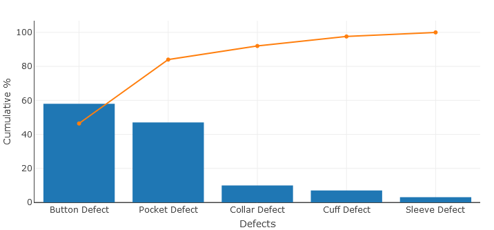
A Pareto Chart is a graph that indicates the frequency of defects, as well as their cumulative impact. Pareto Charts are useful to find the defects to prioritize in order to observe the greatest overall improvement.
Pareto Chart background
In 1906, Vilfredo Pareto an Italian social scientist, discovered that roughly 20% of the population owned 80% of the wealth. From there, he noticed that these proportions described many other aspects of society. This led him to propose the 80-20 rule.
In 1940, Dr. Joseph Juran prominent in the field of operations management, applied the 80-20 rule to quality control for business production. He demonstrated that 80 percent of problems are due to 20 percent of the root causes. By focusing on and reducing the 20% of production problems, a business could increase its overall quality.
A Pareto Chart or Pareto Diagram named in the honor of Vilfredo Pareto, is a type of histogram, which arranges the result from most frequent to least frequent to help identify which root causing are resulting in the most problem.
In order to expand on this definition, let’s break a Pareto Chart into its components.
A Pareto Chart is a combination of a bar graph and a line graph. Each bar usually represents a type of defect or problem. The bars are presented in descending order from highest to shortest. So that, which defects are more frequent, can be seen at a glance. The height of the bar represents any important unit of measure and often presents the frequency of occurrence or cost. The line represents the cumulative percentage of defects.
Create your Pareto Chart
Just take a look at the following table of data to understand what cumulative percentage is.
| Type of Defect | Frequency of Defect | Cum. Frequency | Cumulative % |
|---|---|---|---|
| Button Defect | 58 | 58 | 46.4 |
| Pocket Defect | 47 | 105 | 84 |
| Collar Defect | 10 | 115 | 92 |
| Cuff Defect | 7 | 122 | 97.6 |
| Sleeve Defect | 3 | 125 | 100 |
Cumulative percentages indicate what percentage of all defects can be removed if the most important types of defects are solved.
In the example above, the CumFrequency% for Button Defect is simply (58/125)*100. The last cumulative percentage will always be 100% that is solving just the two most important types of defects — Button Defects and Pocket Defects (58+47 = 105 – will remove 84% of all defects.
In any Pareto Chart, for as long as the cumulative percentage line is steep, the types of defects have a significant cumulative effect. Therefore, it is worth fi1nding the cause of these types of defects and solving them. When the cumulative percentage line starts to flatten, the types of defects do not deserve as much attention, since solving them will not influence the outcome as much.
What is the Pareto Principle?
According to the Pareto Principle, 80% of the results are determined by 20% of the causes. Therefore, it is obvious to find 20% of defect types that are causing 80% of all defects. Although the 80/20 rule does not apply perfectly to the example above, focusing on just 2 types of defects (Button and Pocket) has the potential to remove the majority of all defects (66%).
How to create Pareto Chart in PHP
Now, we have a fair understanding of what the Pareto Chart is. When comes time to build Pareto Charts to analyze defects in your production lines, you should not have to open Excel or any other tool. The Dashboard Builder will create your Pareto Chart in PHP automatically in a few clicks.
CREATE TABLE pareto_pareto (
          Id INTEGER PRIMARY KEY,
          Defects TEXT NOT NULL,
          Frequency INTEGER
);
To insert data into a pareto table, you use the INSERT statement. SQLite provides various forms of the INSERT statements that allow you to insert a single row, multiple rows, and default values into a table. In the following example, we will be inserting our data into pareto table using multiple rows.
INSERT INTO pareto_pareto (Id, Defects, Frequency)
VALUES
          (1, "Button Defect", 58),
          (2, "Pocket Defect", 47),
          (3, "Collar Defect", 10),
          (4, "Cuff Defect", 7),
          (5, "Sleeve Defect", 3);
Now, use the following SQL statement to show the result
select * from pareto_pareto;
| Id | Defects | Frequency |
|---|---|---|
| 1 | Button Defect | 58 |
| 2 | Pocket Defect | 47 |
| 3 | Collar Defect | 10 |
| 4 | Cuff Defect | 7 |
| 5 | Sleeve Defect | 3 |
An example of pareto database in SQLite has been uploaded and available for downloading at this location.
STEP-1: Launch the Dashboard Builder application
Installation
- Download from https://dashboardbuilder.net/download-free-dashboard
- Place the files in a directory on the web server. e.g. …/www/dashboar/dbuilder/
- Unzip the file using Extract Here option to the root folder of "dashboardbuilder"
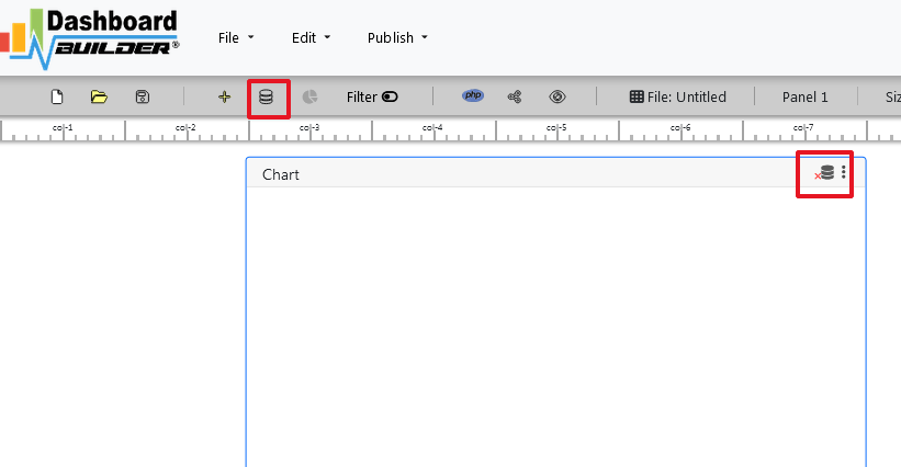
- Type the URL http://localhost/dashboardbuilder in your browser address bar to run dashboard builder. Following welcome screen will appear.
STEP-2: Connect with your database
On the above screen, click the Database icon following screen will appear:

In the above screen, select SQLite from the dropdown of Database list.
Enter your database, in this example we have copied the database in the data folder, so our database path is ../data/pareto.sqlite.
Now save the changes by clicking the “Save changes” button.

STEP-3: Retrieve data from your database
In the above screen, click the chart gear icon to open the chart designing tool. Now, insert the following query in the SQL editor box.
select A.Id, A.Defects, A.Frequency, SUM(B.Frequency)
as CumFrequency, SUM(B.Frequency)/(select SUM(Frequency)
from pareto_pareto)*100 as CumFrequencyPerc
from pareto_pareto A, pareto_pareto B
where A.Id>= B.Id group by A.Id, A.Frequency;
Now, hit the “Run Query” button.The following result will be generated:

STEP-4: Create Pareto Chart
In this example, we will be using to trace, one is for bar chart and which will show the defect and other is line chart which will show the cumulative sum of the frequency.
Now, select Bar from the drop down list of chart type.
Select Defects for X axis and Frequency for Y axis
Our bar chart will show something like this

STEP-5: Save and Share your Pareto Chart
There is several ways you can share your dashboard such as
- Save as PNG by clicking the camera button and send via email attached or upload to any share drive.
- If you are using a public host then you can share your chart just clicking the share but, it will give you a share link for accessing your chart.
- Click the Generate button to generate PHP source code, you will get a window open with the PHP source code of your chart. This PHP code can be integrated your dashboard into any web application written in PHP or any PHP frameworks like Wordpress, Laravel, CodeIgniter, Joomla and others.
Click here to download complete project
How to create a KPI dashboard without writing a single line of code
Creating a perfect KPI dashboard is a method that extends far beyond your computer skills. I found a lot of people jump right into the creating phase of building a KPI dashboard without getting the thinking process done. They think their KPI dashboard software will automatically create it.

Building a KPI dashboard is an iterative process that requires a lot of thought and plan. The most important thing you should know that you intend to monitor key performance indicators (KPIs) on a dashboard; it’s quite another to actually build a dashboard.
As opposed to thinking about the data and or the KPI dashboard tool or even the Key Performance Indicators, let get started to create a KPI dashboard in a different way. Think about your audience, think about who will be using your dashboard and why they want it. The critical success factor for your KPI dashboard must be aligned for a KPI dashboard solution. As with all things technology, it’s the human element that poses the highest level of difficulties.
5 easy steps to create a KPI dashboard
I have tried to outline for creating a KPI dashboard step by step in detail below.
- Define your key performance indicators
- Select your dashboard’s template
- Choose your KPI dashboard software
- Gather and visualize your data
- Share your KPI dashboard
1. Defining your key performance indicators
Well-defined KPIs are the flashpoint of your dashboard. With a meaningless KPI, you might as well be watching the sky for signs that your business is successful. Defining KPIs is actually aligning your business objectives to your business processes. There are lots of KPI examples out there, but the correct way to succeed is by asking questions about your business.

Take the time to understand who you’re building the dashboard for, and you’ll soon understand why you’re building a dashboard in the first place. To define your KPIs matrices, you must start having conversations with the stakeholders from all areas of your business. Asking for input is the first step in drumming up buy-in for a KPI dashboard. Stakeholders will tell you what’s important to them, and this will make your job of creating a dashboard much easier.
An executive will have different data requirements than a manager for example executives may spare more towards a reporting dashboard while a manager may need an operational dashboard. The time you spend consulting with stakeholders will definitely save you time creating the KPI dashboard.
2. Select your dashboard template
With pre-build dashboard templates, you can get the perfect dashboard, already filled with all your preferred KPIs. It is easy to customize to meet your stakeholder's needs. This means you’re ready to go in seconds! You can create your dashboards right away, already pre-filled and ready to share, or simply have a starting point that you can customize as you wish. With the Dashboard Builder, you can create your own KPI dashboard template in just a few clicks.
3. Choose your KPI dashboard software

Select your dashboard software is the most important factor in creating your KPI dashboard. Here are few important factors to be considered when selecting your KPI dashboard software:
- How user-friendly the software is
- Skill required for the visualization
- Pre-requisite and deployment
- Price
- Multiple data source supported
- Distribute your dashboard
An effective KPI dashboard can easily be built in Microsoft Excel. However, the challenge comes when you need to update your KPI dashboard with the data. And at the end of the day, dashboard software saves you time and effect when creating distributing your graphs. Dashboard software is designed to get data out into the organization. For example, building a Salesforce dashboard to share sales KPIs with your executive team.
4. Gathering and visualizing your key data
Gathering data requires getting through different services, working with your IT team to connect to multiple data sources, craft some complex SQL queries and even using JSON or API to automate data retrieval.

At this stage, you’re going to need to spend some time building your data sources. This step causes the most complicated. I can offer the dashboard builder for non-technical users. When chosen the dashboard software this should be kept in mind that the data can be gathered without the mediation of IT skills. There are many dashboard software out there that has the capability to fetch data and generate SQL queries in just a few clicks without any programming.
The most effective dashboards are those that adopt simplicity as their repetition. If you’re faced with a choice between a scatter plot or a bar chart, opt for the bar chart.
A few tips on KPI dashboard design:
- Don’t build a one-size-fits-all dashboard.
- Add comparison values..
- Consider the orientation and arrangement of visualizations carefully..
- Avoid pie charts if you don’t intend to compare your data..
- Limit your use of color. Think traffic lights Red, Yellow and Green..
5. Distribute your KPI Dashboard

Most KPI dashboard software offers multiple distribution options. Consider options like:
- Published links to the dashboard for mass publication
- Email reporting and snapshot capabilities
- Re-distribute to another website via Embedded Code
- Giving direct access to the dashboard itself
Are you ready to try your hand at KPI dashboard ? Try KPI Dashboard free ever!
George Lewis, Digital Marketing @DashboardBuilder
What should be included in a business dashboard?
The four most fascinating aspects of building a business dashboard — How to start using it? Just take a quick look in a glance

This article discusses the most important and critical aspects of a business dashboard that must be included in your business dashboard and how to begin using it at a glance.
Business dashboards are extremely important for a great number of reasons for visualizing your business data: They help you to manage business complexities, provide quick access to authentic information about your business, and help you in following through with action to be taken.
No one can refuse their benefits and importance and wanted to create one but might be not sure how and from where to start. You might have heard this story so many times before, so I have written this blog for you.
So, let's get started. First of all, you should know the stakeholders of your audience. Your audience is the senior-level management at your organization, a group of departmental directors, or C-level leadership you should keep this in your mind.
It does no harm for you to share bad news with your senior management, as a business dashboard is meant particularly for the senior-level management and not for consumption outside of the business unit. Although, there’s a common practice in many organizations to add spin to certain news as it makes someone upset in the management chain, but that is the wrong practice for a solid business dashboard. The truth needs to be out there so the senior-level leadership in your organization can see the problems the organization is facing and make the right decisions to overcome the problem.
To keep that in mind, I’ve outlined a few important things you must include in your business dashboard template—and some additional tips and tricks to get you on your feet.
1. Include RAG status indicators to your business dashboard

RAG —or red, amber, green—statuses are important to include on a business dashboard template so the stakeholder knows what's important and what to focus on. RAG acts as traffic lights, red is an alert, amber (or yellow) signals caution, and green means you’re in the clear. If a measure is green, the stakeholders know this is in a comfortable area and to skip over it so they can pay more attention to those that are the possibility of something unwelcome, such as yellow and red are examples.
2. Balance of Key Performance Indicators

It’s important to have a balance of KPIs across all of your graphs. Because management meetings tend to depend a great deal on financial metrics, but may not take into consideration things happening in the organization that could be affecting those financials. Using it has been observed that a strategic framework allows you to incorporate measures from across your organization, effectively solving this problem. You can, for instance, look at your HR metrics to ensure that the right people are in the right positions and at the customer, metrics to see if your customers are happy.
If you need some ideas of what is important to include, take a look at these KPI dashboards:3. Include qualitative analysis for quick interpretation.

Executive team can easily understand if you provide numbers along with the qualitative analysis. Simply providing numbers leaves a lot of room for interpretation from the team, but adding context gives them the complete story. There’s a big difference between saying, “Our sales are down for the month of March,” and saying, “Our sales are down for the month of March because no one wants to buy winter clothes when it’s 70 degrees outside. As we see this trend consistently year after year. As our customers begin thinking about winter in November through February, our sales will go up.”
In the above example, you can see how providing qualitative information that can be consumed by the executive team easily is important.
4. Include major projects and initiatives.

You must realize that most people think their project should be prioritized for one reason or another. If you’re the person working with the management team, you'll only include the most critical projects in the business dashboard and filter out the low weightage projects.
If a project is important enough to be discussed at the managerial level, it likely involves multiple departments and is critical to the business at large. For example, if the Finance department is trying to create a new committee, that’s not a whole-of-business initiative. But if they’re opening a new cost center—which likely involved several teams and a great deal of oversight—this likely qualifies as something the management team needs to be briefed on.
To determine how often the management team will meet to review the business dashboard, it depends on several factors, including how much information is available and how often those metrics are useful. Do they need to meet quarterly or would it be more useful to meet every month?
Regardless of what you choose, you need to stick to a schedule and have a regular reporting process. Everyone in the organization should know when to sit down to review the business dashboard. This keeps all the stakeholders moving fluidly and helps keep those who need it on track with deadlines.
Conclusion:, business dashboards are very important, so you might be feeling pressure from your team, executive group, or competitors to create one. But before you do, be sure to think through its purpose, focus, and use, so it’s as effective as possible.
Are you ready to try your hand at business dashboard ? Try Business Dashboard free ever!
George Lewis, Digital Marketing @DashboardBuilder
Dashboard App for MS Windows 10
Your FREE data visualization tool for MS Windows

Dashboard App Windows overview
A dashboard app a data visualization tool for Windows that visually tracks analyzes and displays graphs, charts, key performance indicators (KPI), metrics, and key data points to monitor your business.
Dashboard App for Windows which installs directly on a computer having Microsoft Windows 7 & 10 or later version installed. No web server or 3rd party application required can be faster and more responsive. Doesn't need to rely on internet connectivity to run the software
Our dashboard app gives you access to live data in Apache Server. Check-in on your business anytime on your Phone, Tablet, or Personal Computers.
Dashboard app comes with a variety of different charts that includes line chart, scatter chart, bar chart, pie chart, donuts chart, bubble chart, stack chart, area chart, heatmap chart, Sankey diagrams, and choropleth map, etc. Dashboard app for Windows can be used to create either static or real-time database-driven dashboards with data coming from a variety of sources such as MySQL, MS SQL, SQLite, ORACLE, PostgreSQL, Sybase, and Cubrid with no programming required. A part of the community, this dashboard app is designed to integrate with a PHP application you may be using and also import data from Google Driver, MS Excel, and CSV files.
Getting Started
Let's get started with our Dashboard app Windows, the dashboard app Windows generates PHP source code for your web application. Not only, but it also generates embedded code in HTML, which helps to republish your dashboard in an embedded. For this, we will be demonstrating with our freely available drag and drop desktop-based Dashboard app for Windows. To install and run the Dashboard app, the following are the requirements.
Requirements
Our Dashboard app can be installed in MS Windows. Folloing is the details of the requirements.
- Windows 7 or later. Old operating systems like Windows XP and Vista are no more supported.
- Requires "Visual C++ Redistributable for Visual Studio 2015" installed
- Firefox 52, Chrome 57, IE 8, or any other Browsers support SVG
Installation
There is a Free version of Dashboard app available for trail bases,
STEP-1: Download from the following location
https://dashboardbuilder.net/download-free-dashboard-desktop

STEP-2: Double click the file

STEP-3: Click next button

STEP-4: Click next button

STEP-5: Click Finish button

Dashboard app examples
When you launched the dashboard app the following screen will appear, in which you can select the lange and go through with take a tour. Curently Dashboard app Window supports English, Freanch, German, Spanish, Italian & Portuguese.

STEP-1: Connect with your Database
- Run the web folder in your browser. e.g. http://localhost/dashboardbuilder following welcome screen will appear.
- This is the main panel of the Dashboard app. This is a HTML5 based fully responsive interface built in PHP, HTML, JavaScript and CSS. The interface has a minimal design with a drag-and-drop feature that allows you to add multiple chart panel to customize the dashboard on according to the way you want.
- Now Click the Database icon
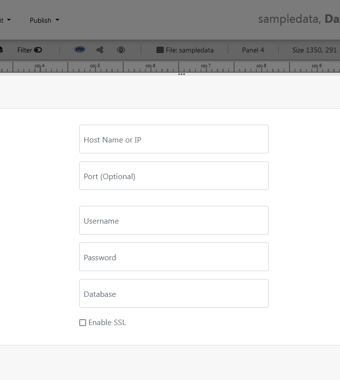
- Following screen will appear. In our dashboard app example, we will use the sample SQLite database called Northwind.db to connect and fetch the data. Now, Select Database from data source tab. Select SQLite from the drop down list of Database, Enter your
"../data/Northwind.db"in the DB name field and Save changes as mentioned in the screen.

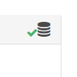
- When you click the save changes, a green tick mark with Database will appear that shows that your database is successfully connected.
STEP-2: Chart settings
- In our next step, we will fetch data from the database we have just connected. Select the gear icon for your Chart preference.
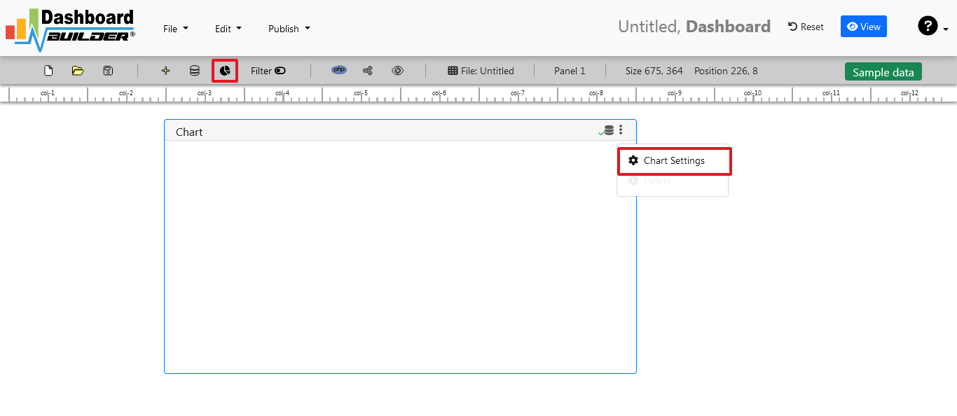
- The following screen will appear. List of the tables from Northwind.db will appear on the table list as shown in the picture below.

STEP-3: SQL statements
- In our example, we will be creating a simple Dashboard app for our sales management. This dashboard app will contain a chart where users can find the sales stats and maintain the data about the products.
- Now, enter the following SQL statement in text box in a following manner
SELECT strftime('%Y-%m',o.shippeddate) as xaxis, sum(d.quantity) as yaxis from `order details` d, orders o where o.orderid = d.orderid group by strftime('%Y-%m',o.orderdate) limit 50
- Now, we want to execute our query and fetch the data from the tables. Click the Run Query button
- Query Result will appear. Now, we have to assign x-axis data to the x-axis column and y-axis data to the y-axis column. Select your x-axis data from the drop down list of X and y-axis data from the drop down list of Y .
- Click Save Changes
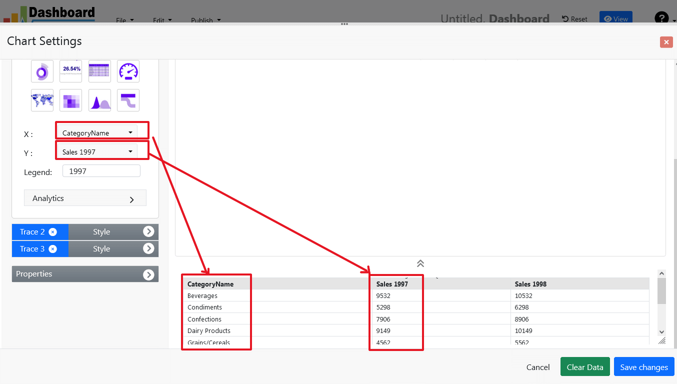
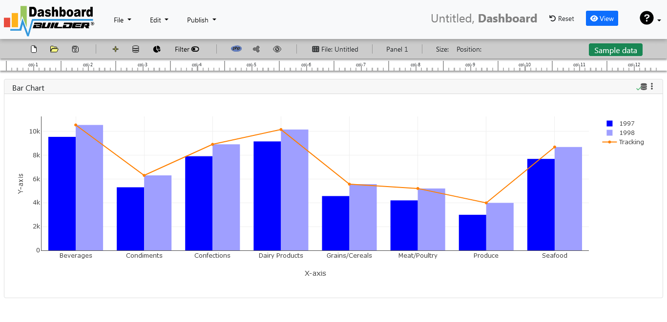
- Charts will be appeared on the screen as shown below.
STEP-4: Adjust the position
- You may adjust the size and the position of the Chart Panel by dragging its corner. The size and position are fully responsive according to the Bootstrap framework
STEP-5: Code generation
- So far we have successfully build our dashboard. In this step we are going to generate PHP source code for dashboard we have just created. Click the Generate button to auto-generate PHP source code for our dashboard

- PHP code for the chart will automatically generate, you may copy past this code to your Dashboard app.
Auto-generated PHP source code
Following is an example of auto-generated PHP source code. You may copy & paste the following PHP source code in your web application.
/**
 * DashboardBuilder
 *
 * @author Diginix Technologies www.diginixtech.com
 * Support  - http://www.dashboardbuilder.net
 * @copyright (C) 2018 Dashboardbuilder.net
 * @version 2.1.5
 * @license: license.txt
 */

include("inc/dashboard_dist.php");  // copy this file to inc folder


// for chart #1
$data = new dashboardbuilder();
$data->type =  "line";

$data->source =  "Database";
$data->rdbms =  "sqlite";
$data->servername =  "";
$data->username =  "";
$data->password =  "";
$data->dbname =  "data\Northwind.db";
$data->xaxisSQL[0]=  "SELECT strftime(^%Y-%m^,o.shippeddate) as xaxis, sum(d.quantity) as yaxis from `order details` d, orders o  where o.orderid = d.orderid group by strftime(^%Y-%m^,o.orderdate) limit 50";
$data->xaxisCol[0]=  "xaxis";
$data->yaxisSQL[0]=  "SELECT strftime(^%Y-%m^,o.shippeddate) as xaxis, sum(d.quantity) as yaxis from `order details` d, orders o  where o.orderid = d.orderid group by strftime(^%Y-%m^,o.orderdate) limit 50";
$data->yaxisCol[0]=  "yaxis";
$data->name = "linechart";
$data->title = "Line Chart";
$data->orientation = "";
$data->xaxistitle = "x-axis title";
$data->yaxistitle = "y-axis title";
$data->showgrid = "";
$data->showline = "";
$data->height = "167";
$data->width = "";
$data->col = "0";
$result[0] = $data->result();

?>

<!DOCTYPE html>
<html>
<head>
	<script src="assets/js/dashboard.min.js"></script> <!-- copy this file to assets/js folder -->
	<link rel="stylesheet" href="//maxcdn.bootstrapcdn.com/bootstrap/3.2.0/css/bootstrap.min.css"> <!-- Bootstrap CSS file, change the path accordingly -->

<style>
@media screen and (min-width: 960px) {
.id0 {position:absolute;margin-top:67px;}

}
.panel-heading {line-height:0.7em;}
#kpi {font-size:34px; font-weight:bold;text-align:center;}
#kpi_legand {font-size:11px; color:#999;text-align:center;}
</style>


</head>
<body>

<div class="container-fluid main-container">
<div class="col-md-12 col-lg-12 col-xs-12">
<div class="row">
<div class="col-md-4 col-lg-4 col-md-offset-4 col-lg-offset-4 col-xs-12 id0">
<div class="panel panel-default">
<div class="panel-heading">Line Chart</div>
    <div class="panel-body">
        <?php echo $result[0];?>
    </div>
</div>
</div>
</div>
</div>
</div>
</body>
This auto-generated PHP code is under MIT license, which you may customize as per your desire needs and can be used an anywhere you want. You can find the complete information about the license here
Conclusion
Now we have a PHP based dashboard that can be used with any web application that was customized to fit the requirements of the web design. The project also offers free and paid plans. You can also download Dashboard app FREE version. The code for Dashboard app can be found on GitHub under this license
Best of all, with our Standard and Enterprise licenses include 100% source code, for you to enhance the functionality or incorporate Dashboard app into your web application or any PHP software solutions/products, analytics/data science/data warehouse enterprise systems or Joomla, Wordpress or Drupal sites.
All editions of our Dashboard app series are still fully functional, for sale and supported and provides increasing levels of support to address the queries of users and developers.
Our Dashboard app can also be implemented using an online API where you don’t have to mix with PHP code. The online API uses universal HTML code which can be used in any platform. The data will be added or retrieved from the database using the API. You may find more information about the Online Dashboard.
You may want to take a look at our complete documentation and video tours of the latest version along with a live tour of user interface and step by step instructions for performing key features.
 the file dashboard.zip using Extract Here option to the root folder of "dashboardbuilder"