KPI Reporting Tool: Examples, Templates & Best Practices
Numbers are everywhere in business. The trick isn't finding data — it's turning it into something people can actually act on. That's exactly what a KPI report does. In this guide, we'll walk through what a KPI report actually is, show you real examples by industry and role, and share the best practices that separate a report people ignore from one that actually drives decisions.
What is a KPI Report?
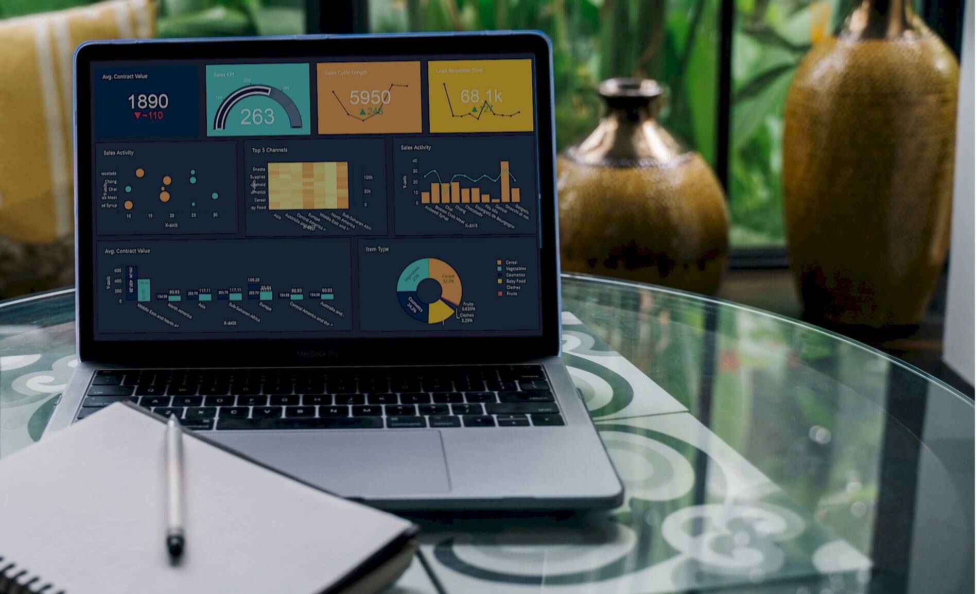
Let's keep it simple: a KPI report is a document (or, these days, an interactive dashboard) that pulls together your key performance indicators so leaders can see, at a glance, how the business is actually doing against its goals.
Old-school KPI reports were static — a PDF or spreadsheet somebody built once a month and emailed around. By the time you read it, the numbers were already out of date. Modern KPI reports look totally different. They're built on live dashboards, so the data underneath is just a click away. That means even people who aren't "data people" can spot a trend, catch an outlier, or understand why a number moved — without waiting on an analyst to explain it.
And that's really the whole point of a KPI report: it should lead somewhere. Insight without action is just trivia.
KPI Report Examples and Templates
The best KPI reports don't try to show everything. They strip out the noise and keep only the metrics that matter to the team looking at them. A sales rep doesn't need supply chain data, and a warehouse manager doesn't need marketing attribution numbers. Below are some of the most common report formats teams build with a KPI reporting tool like Dashboard Builder.
Types of KPI Reports
Not every KPI report is built for the same audience or the same purpose. Here are the four you'll run into most often:
KPI Report By Industry
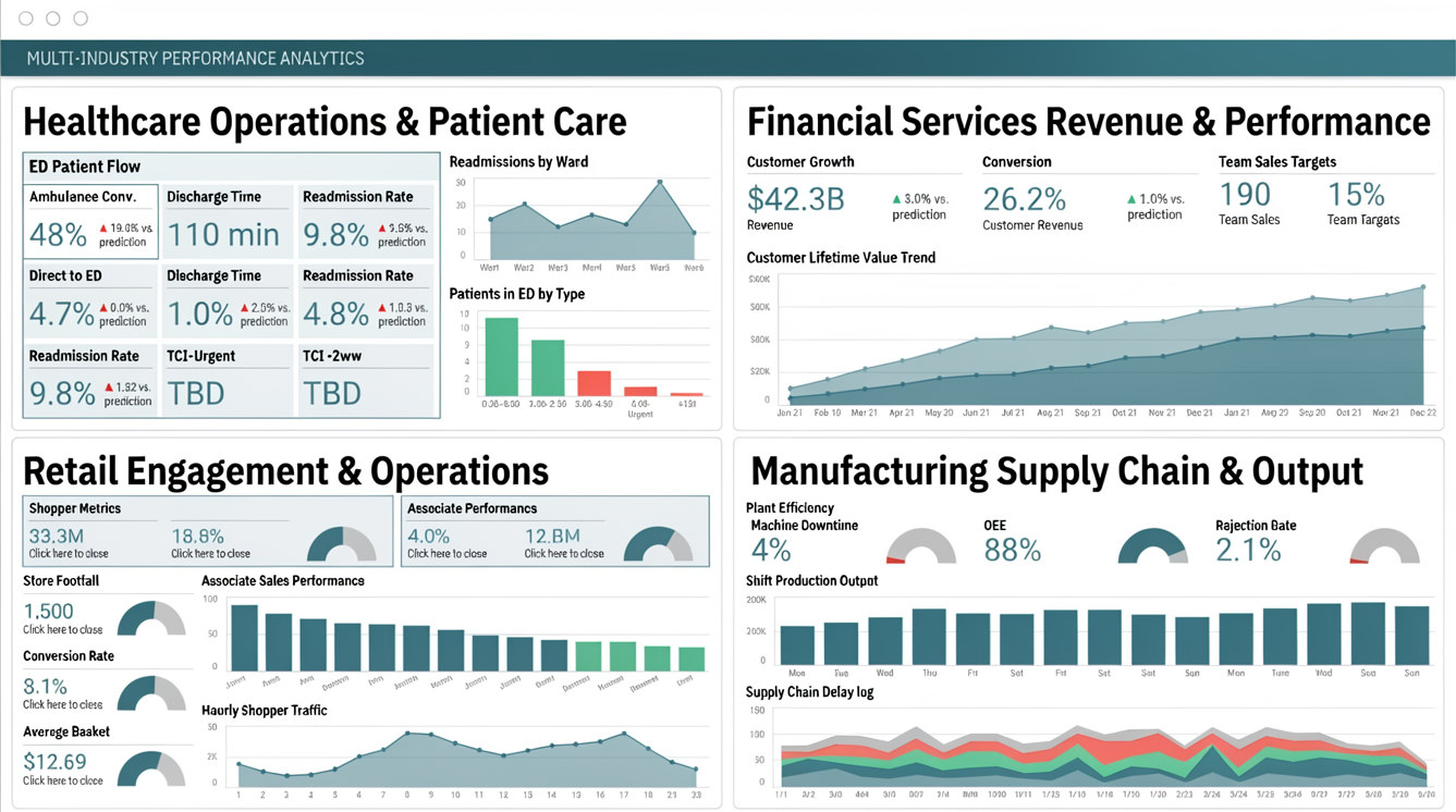
Every industry has its own scorecard. Here's a quick look at what different sectors typically track:
- Healthcare: Patient care and operations metrics — think ambulance conversion rates, discharge times, and readmission rates.
- Financial Services: Customer and team performance indicators aimed at growing revenue while keeping costs down.
- Retail: Shopper engagement and associate performance, from footfall to conversion rate to average basket size.
- Manufacturing: Supply chain and operational efficiency — downtime, rejection rate, and machine output are the usual suspects.
- Public Sector: Citizen experience and regional performance data used to find efficiencies in public services.
KPI Report By Job Function
Beyond industry, the department you sit in shapes what "good" looks like. Here are the metrics each function usually leans on.
Finance KPIs
| Finance KPI | What It Means | Why It Matters |
|---|---|---|
| Gross Profit Margin | (Revenue − cost of goods sold) ÷ revenue | Shows how much you keep on every dollar of sales before expenses. |
| Net Profit Margin | Net income ÷ sales | The real test of whether your company can turn a profit. |
| Current Ratio | Current assets vs. current liabilities | Tells you if you can cover your debts. Aim for 1 or higher. |
| Return on Equity | Net income ÷ average shareholder equity | A high ROE signals your company can grow using what it already has. |
| Inventory Turnover | (Total sales × cost of sales) ÷ remaining inventory | Shows how efficiently stock is moving. Higher is usually better. |
Sales KPIs
| Sales KPI | What It Means | Why It Matters |
|---|---|---|
| Product Performance | Ranks products by revenue over a chosen period | Shows your team what's selling — and what needs a second look. |
| Sales Growth | Previous period revenue ÷ current period revenue | Reveals your pace of growth and what's needed to keep it up. |
| Quote to Close Ratio | Number of quotes ÷ number of wins | A consistent way to measure real customer interest. |
| Average Purchase Value | Total sales ÷ number of sales | Helps you understand basket size and upsell opportunity. |
Marketing KPIs
| Marketing KPI | What It Means | Why It Matters |
|---|---|---|
| Traffic Sources | Visitors broken down by channel | Shows where your audience is actually coming from. |
| Cost Per Lead | Campaign cost ÷ leads generated | Justifies the marketing spend, campaign by campaign. |
| Conversion Rate | Leads ÷ wins | Tells you if you're attracting the right kind of lead. |
| SEO Keyword Ranking | Position in search results per keyword | Higher rankings mean more clicks — and tell you where to focus content. |
Production KPIs
| Production KPI | What It Means | Why It Matters |
|---|---|---|
| Rejection Rate | Rejected pieces ÷ processed pieces | Keeping this near zero helps cut operational costs. |
| Overall Equipment Effectiveness (OEE) | Availability × Performance × Quality | A higher OEE means you're squeezing more value from staff and machines. |
| Downtime | Time a machine or line isn't producing | One of the most important numbers on a factory floor — less downtime, more profit. |
KPI Report By Job Role

Sometimes the most useful KPI report is built around one person's job, not a whole department. Take a Chief Marketing Officer (CMO) report, for example. It shows performance across the entire marketing funnel so leadership can spot opportunities fast, typically featuring KPIs like:
- Total visits
- Opportunities by quarter
- Net-new logos by quarter
KPI Report By Initiative
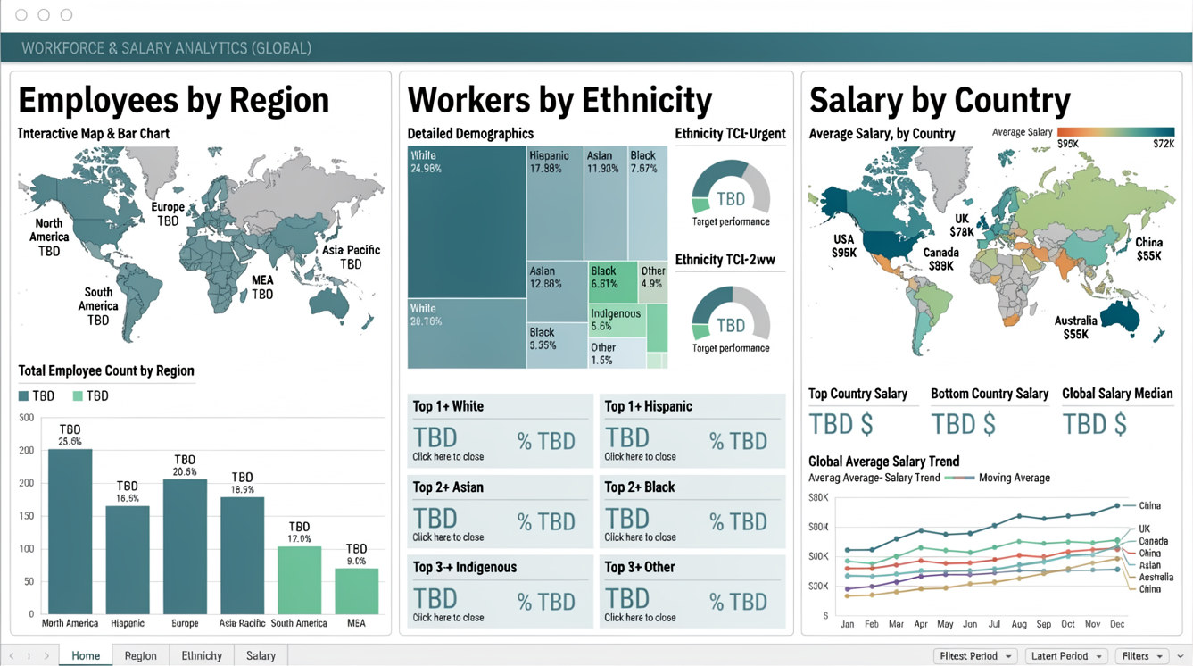
KPI reports aren't only about departments or roles — they can also track a specific company initiative. A workforce diversity report, for instance, tracks demographic data by region so a company can measure progress toward inclusion goals, typically including:
- Employees by region
- Workers by ethnicity
- Salary by country
The Difference Between a KPI Report and a KPI Dashboard
People use these two terms interchangeably, but they're not quite the same thing. A KPI report that's built as an interactive dashboard is pretty similar to a modern KPI dashboard. But a traditional, static report — the kind that gets exported as a PDF and emailed out — behaves very differently from a live, clickable dashboard.
| Pros | Cons | |
|---|---|---|
| Traditional, Static KPI Report | Simple for every stakeholder to review, no learning curve | A snapshot in time — can be outdated within days, and doesn't let you dig deeper |
| Interactive KPI Dashboard | Data is up to date (even real-time), and users can explore freely | Stakeholders need a bit of confidence to explore data on their own |
The good news? With a tool like Dashboard Builder's KPI dashboards, you don't have to choose one or the other — you can export a clean static report for the board meeting and keep the live dashboard running for the team that needs to dig into the details every day.
How to Prepare a KPI Report: Best Practices
Building a KPI report should be simpler than it usually turns out to be. Here's what actually makes a report land with your audience:
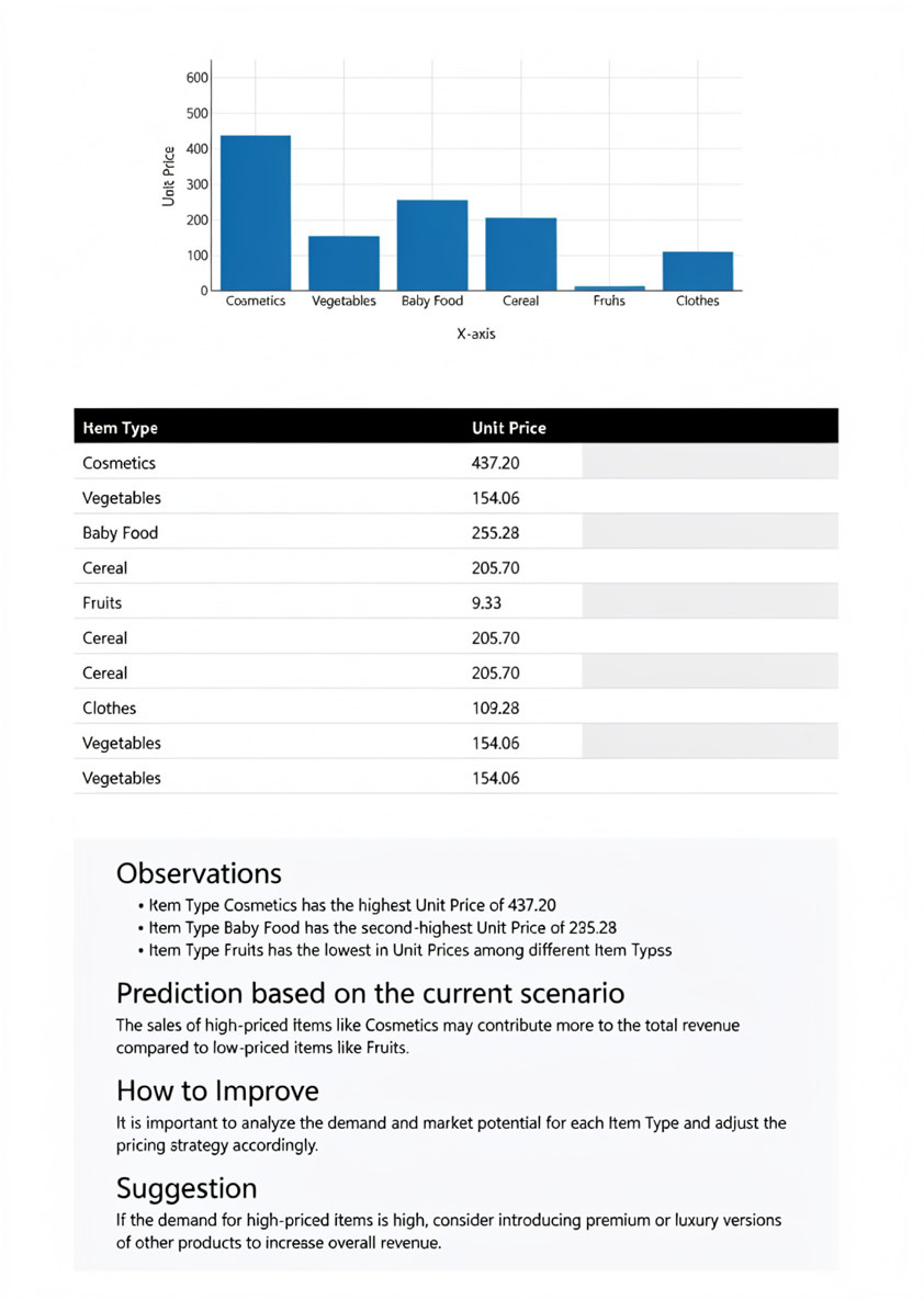
Select and open chart settings. Click on the chart you wish to view and export data from. Select "Edit" > "Chart Settings", or double-click the top bar of the chart.

Enable data analysis. In the Chart Settings Window, expand the Properties panel and select "Show Analyze Data" (or select "Hide" if you prefer to restrict access). Click "Save Changes".

Access analysis results. Hover over the chart in your report and click on the "Analyze Data" icon to open the analysis report popup.

Review observations. Summarize key observations and insights derived from the analysis, highlighting prominent trends, patterns, or anomalies.
Examine predictions. Utilize predictive analytics to forecast future trends or outcomes and gain insight into potential future developments.
Apply improvements and suggestions. Evaluate actionable recommendations and suggested strategies to address identified challenges and optimize performance.
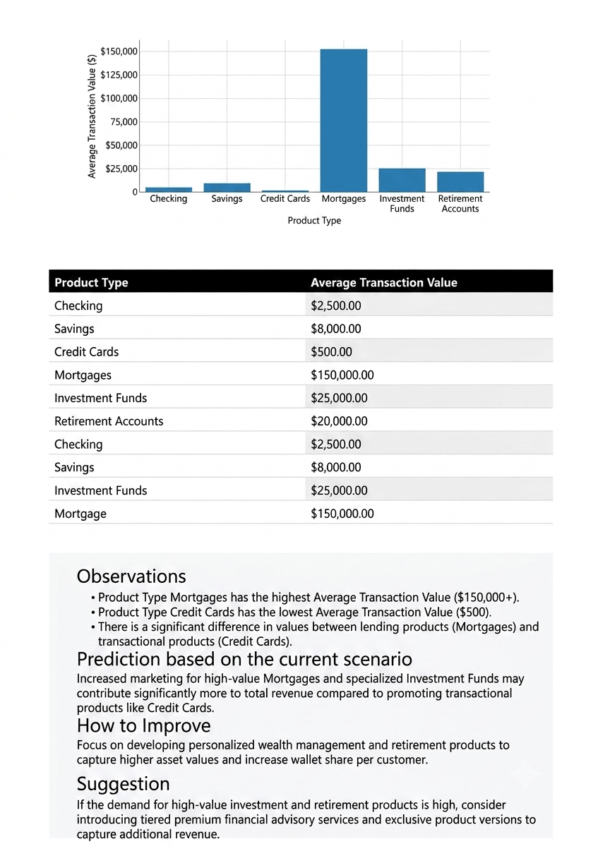
Data export functionality in Dashboard Builder is designed to streamline the process of transferring chart data into CSV format, making it easy to complement your automated analysis with offline reporting and raw data sharing.
FAQs
Why Dashboard Builder?
Because building a KPI report shouldn't require a data science degree. Dashboard Builder lets you connect your data, drag charts onto a canvas, and publish a report or live dashboard in minutes — on-premises, in the cloud, or fully offline on desktop.
Agentic AI
Dashboard Builder is evolving alongside the shift toward agentic AI, using intelligent analysis to help surface anomalies, generate forecasts, and flag the numbers worth your attention — so your KPI report doesn't just show data, it helps you understand what to do next.
Data Integration and Quality
A KPI report is only as trustworthy as the data behind it. Dashboard Builder connects directly to databases (MySQL, MS SQL, PostgreSQL, and more), spreadsheets, and web applications, so your KPIs are always pulled from a single, reliable source of truth instead of a patchwork of manual exports.
Dashboard Builder Cloud Analytics
Prefer working in the cloud? Dashboard Builder's cloud version gives you the same real-time KPI reporting power, accessible from any device, with built-in collaboration so your whole team can view and explore the same live report together.