How to create a Choropleth Map in 3 easy Steps
A step-by-step Guide for Beginners
What is a Choropleth Map and how to create it - Definition with Examples
A choropleth map is a thematic map that uses symbols or coloring to depict statistical data – technically, the color mapping symbology technique. These maps are created on specific geographic locations, such as a country map or a global map.

Choropleth Map History
Baron Pierre Charles Dupin created the first known choropleth map in 1826, depicting the availability of basic education in France by department.In France, more "cartes teintées" ("tinted maps") were quickly produced to visualise other "moral statistics" on education, disease, crime, and living conditions.
Due to the increasing availability of demographic data compiled from national Censuses, choropleth maps quickly gained popularity in several countries, beginning with a series of choropleth maps published in the official reports of the 1841 Census of Ireland.
After 1850, when chromolithography became widely available, colour was increasingly added to choropleth maps.
The term "choropleth map" was coined by geographer John Kirtland Wright in 1938 and was widely used by cartographers by the 1940s. Glenn Trewartha reintroduced them as "ratio maps" in 1938, but this term did not survive.
Choropleth Map Example
A police analyst is investigating crime rates throughout the cities as well as the relationship between crime and other social issues such as high unemployment rates. In an effort to reduce crime, the officials will use the findings to implement new social programming throughout the cities.
A choropleth map can be used to visualise and compare unemployment rates in police districts throughout the cities.

The darker areas in the above map indicate high unemployment, while the lighter areas indicate low unemployment. A choropleth map can also be used to illustrate a country's GDP rate.
The darker areas in the map below represent high GDP rates, whereas the lighter areas represent low GDP rates.

Why Create a Choropleth Map?
There are numerous reasons why you might want to make a choropleth map. Choropleth maps are simple to make and easy for map readers to understand. A choropleth map excels at displaying the overall geographic pattern of variables. Because each colour or shade has a value or range of values assigned to it, the map reader can easily determine the values displayed on the map. Choropleth maps are also useful for comparing different choropleth maps to see how the spatial distribution of variables changes. Small multiples are multiple small maps on the same page. A small multiple is a collection of small choropleth maps with similar structure and context.
It is critical that the choropleth map only displays data that can be linked to an enumeration area. An enumeration area is a location where information is collected and combined. States, counties, and regions are common enumeration areas in the United States. It is critical to normalise the data against enumeration areas or a total population true blue area or size bias. What is meant by area or size bias? Is it the fact that larger areas may have a higher population simply because there is more space for people to live? Because there is less space to live in, smaller areas will naturally have fewer people.
How to create a Choropleth Map?
A choropleth map is essentially a useful data visualization tool for answering data-driven questions such as how percentages or rates compare across geographic regions. A choropleth map connects two datasets because it paints data for a given value on another dataset.
Colors are assigned to the numeric values in the dataset that you want to represent on a choropleth map. The corresponding map areas are then color-coded to correspond to the value.
A Choropleth is a map which uses differences in shading, colouring, or the placing of symbols within predefined areas to indicate the average values of a particular quantity in those areas.
For example, how do continent population data compare? Or, how do the election results for each county in the United States compare?
Simply glance at the table of data below to see what the cumulative percentage is.
| ID | Country Code | Country Name | GDP |
|---|---|---|---|
| 01 | AFG | Afghanistan | 21.71 |
| 02 | ALB | Albania | 13.4 |
| 03 | DZA | Algeria | 227.8 |
| 04 | ASM | American Samoa | 0.75 |
| 01 | AND | Andorra | 4.8 |
Now, we have a fair understanding of what the Choropleth Map is. In this user guide, we'll make a simple choropleth map before generating the PHP source code for Choropleht map. To accomplish this, we will use the dashboard builder. The following prerequisites must be met before installing and running the data visualization tool.
Requirements
The Dashboard Builder can be installed any platforms like Windows, Linux, Mac and Ubuntu or any other platforms support Apache.
- PHP Version 7.2 or later
- Apache 2 or later
- Windows 7 or later /Linux 3 or later
- Firefox 52, Chrome 57, IE 8
Installation
- Download from https://dashboardbuilder.net/download-free-dashboard
- Place the files in a directory on the web server. e.g. …/www/dashboar/dbuilder/
- Unzip the file using Extract Here option to the root folder of "dashboardbuilder"
STEP-1: Launch the Dashboard Builder application
- Access the web folder in your browser. e.g. http://localhost/dashboardbuilder following welcome screen will appear.

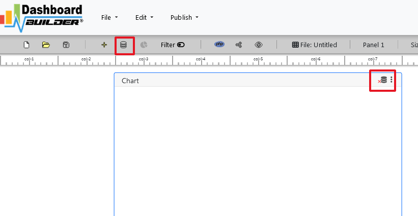
- Now Click the Database icon
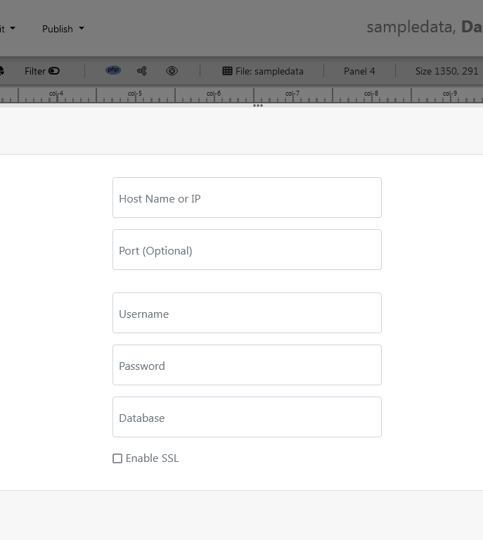
- The next screen is displayed. Select a database on the Data Sources tab. Select SQLite from the database drop-down menu, enter
../data/country.dbin the Database name field and follow the on-screen instructions to save the changes.

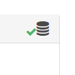
- When you click the Save changes , A green tick mark with a database appears, indicating that your database has been successfully connected.

STEP-2: Access the data
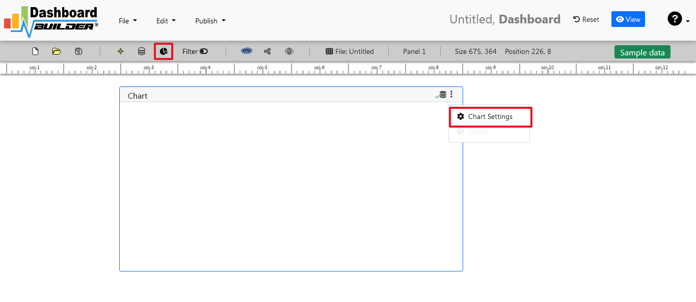
- In the next step we will retrieve the data from the database we just connected. Select the gear icon to the chart preferences.

- In the next screen a list of tables is displayed.
STEP-3: Assign data
- Select Country Code from the drop down list of Loc (Location), GDP from the Z, Country Name from the Text and World from the Map fields on the following screen.

- Click Save Changes
Save and Share your Choropleth map
There is several ways you can share your dashboard such as:
- Save as PNG by clicking the camera button and send via email attached or upload to any share drive.
- If you are using a public host then you can share your chart just clicking the share button, it will give you a share link for accessing your choropleth map.
- Click the Generate button to generate PHP source code, you will get a window open with the PHP source code of your choropleth map.
Choropleth Map in PHP using Dashboard Builder in easy way. Following is the PHP code to generate a Choropleth Map using Dashboard Builder
/**
 * DashboardBuilder
 *
 * @author Diginix Technologies www .diginixtech .com
 * Support <support @ dashboardbuider.net> - http: // www. dashboardbuilder .net
 * @copyright (C) 2017 Dashboardbuilder.net
 * @version 1.0.1
 * @license: license.txt
 */

include("inc/dashboard_dist.php");  // copy this file to inc folder


// for chart #1
$data = new dashboardbuilder();
$data->type =  "map";
$data->source =  "Database";
$data->rdbms =  "sqlite";
$data->servername =  "";
$data->username =  "";
$data->password =  "";
$data->dbname =  "data\country.db";
$data->xaxisSQL[0]=  "SELECT CODE FROM  GDP";
$data->xaxisCol[0]=  "CODE";
$data->yaxisSQL[0]=  "SELECT GDP FROM  GDP";
$data->yaxisCol[0]=  "GDP";
$data->textSQL[0]=  "SELECT COUNTRY FROM  GDP";
$data->textCol[0]=  "COUNTRY";
$data->name = "map";
$data->title = "";
$data->orientation = "";
$data->xaxistitle = "";
$data->yaxistitle = "";
$data->showgrid = "";
$data->showline = "";
$data->height = "";
$data->width = "";


$result[0] = $data->result();

?>

<!DOCTYPE html>
<html>
<head>
	<script src="assets/js/dashboard.min.js"></script> <!-- copy this file to assets/js folder -->
	<!--<link rel="stylesheet" href="assets/css/bootstrap.min.css"> Bootstrap CSS file, change the path accordingly -->

<style>
<!-- adjust the height width as per your need -->;
/*
#col0{
height:350px;
}
#col1{
height:350px;
}
*/
</style>

</head>
<body>

<div class="container">
<div class="col-lg-12">
<div class="panel panel-default">
<div class="panel-heading"></div>
    <div class="panel-body">
        <?php echo $result[0];?>
    </div>
</div>
</div>
</div>
</body>
This PHP code can be integrated your dashboard into any web application written in PHP or any PHP frameworks like Wordpress, Laravel, CodeIgniter, Joomla and others.
In case you prefer to watch, here’s a video tutorial to walk you through the process of creating a Choropleth Map.